


September is the only month since 1950 that has more down months than up months for the S&P 500. This makes many investors wonder if a market top is forming.
Since 1950 the index has had 12 corrections that fell more than 10 % from a record high but stayed above the 20 % level needed for a bear market. Half of those corrections began in July, August, or September. My own research shows that the worst period to own the index is from July 17 to September 26.
Even with that history, the current technical picture still leans bullish. Let’s walk through the charts from long‑term to daily time frames.
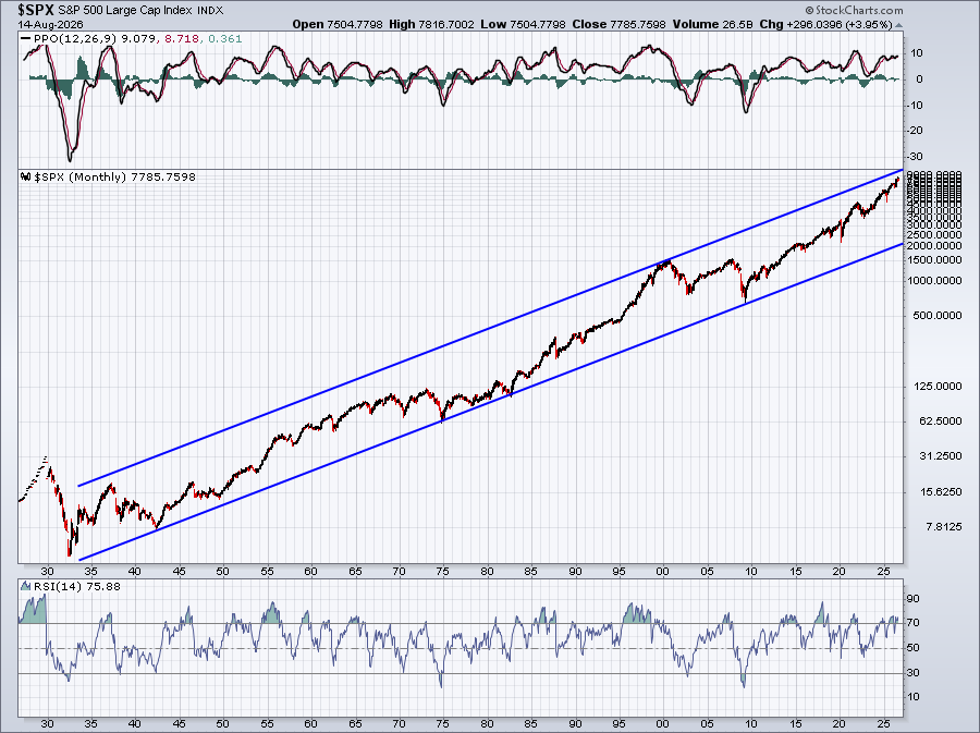
The monthly chart stays in an uptrend. While the index looks a bit overbought, that is normal during a long‑term bull market.
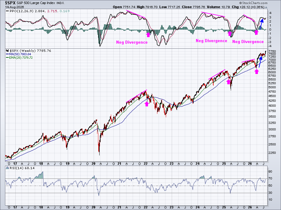
On the 10‑year weekly chart we can spot a few past negative divergences that warned of slowing strength. Each time the index later fell to its 50‑period moving average and then recovered. Right now the PPO indicator is climbing away from the centerline, and the weekly RSI sits at 68 – still below the overbought zone.
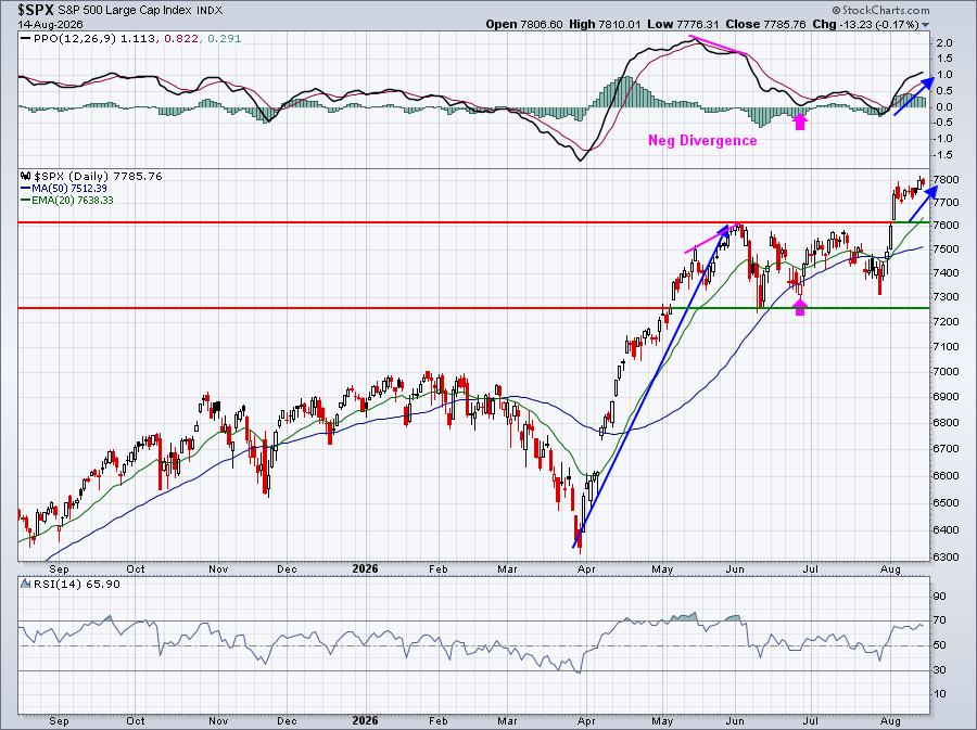
The daily price action matches the weekly strength. New all‑time highs are being made with solid momentum, which usually leads to more gains rather than a quick correction.
What to watch next
Seasonal risk does rise in September, so keep an eye on any sudden drops in momentum. However, the current evidence – higher trends on monthly, weekly and daily charts, plus healthy RSI levels – still points to more upside for the S&P 500.
Stay informed, watch the charts, and trade wisely.
Source: Materials provided by https://articles.stockcharts.com.Note: Content may be edited for style and length.