

An overbought reading usually means a bearish sign because downside risk looks higher than short‑term gains. Yet, technical analysis has important exceptions.
A breadth thrust is a signal that appears when many stocks turn from bearish to bullish at the same time. It shows broad buying, not just a few big names. Historically, these signals show up at the start of big market moves and often lead to strong returns for the next year or more.
What many traders forget is that bullish signals can also appear when breadth data is missing but short‑term price momentum becomes extreme. This matters because many markets lack long‑term breadth records.
Price thrust momentum is measured with a short‑term rate‑of‑change (ROC) over 10 days to 13 weeks. When the ROC hits a multi‑year low and then flips to a multi‑year high, it signals a full round‑trip in investor sentiment.
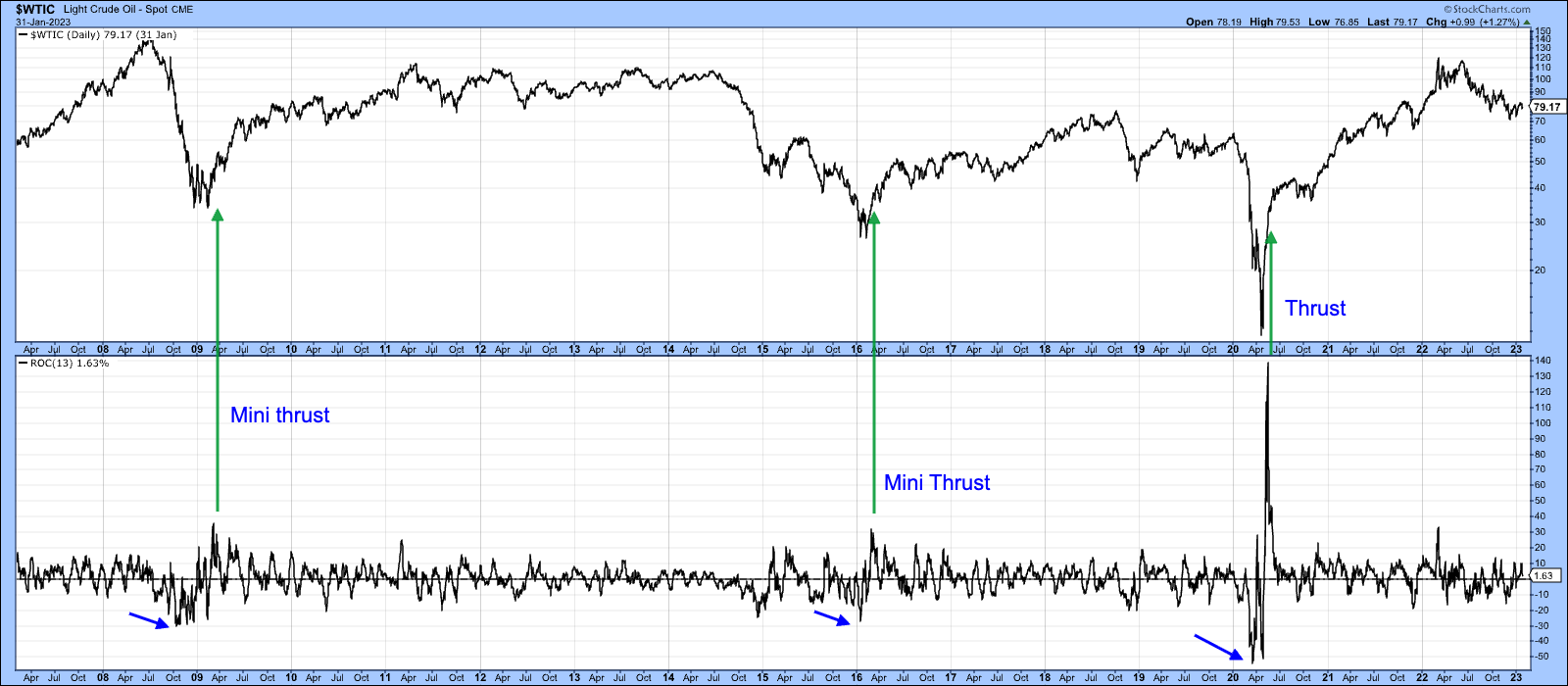
Chart 1 shows three price thrusts in WTI crude oil. Two rules must be met: first, the ROC must record a multi‑year low, then it must reach a multi‑year high. All three thrusts were later followed by major bull markets.
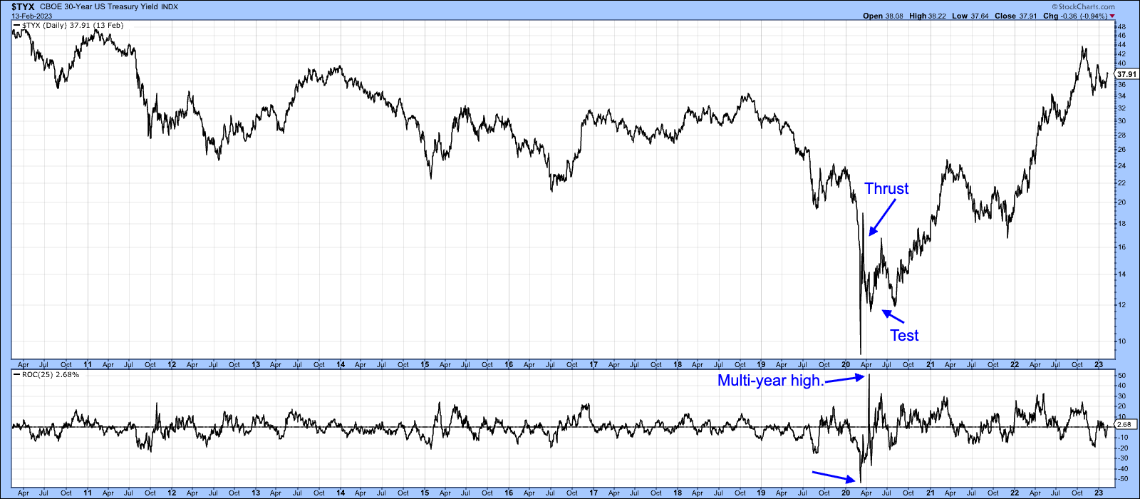
Chart 2 applies the same idea to the 30‑year U.S. Treasury yield. The thrust first tested lower levels before yields continued their upward climb.
What About Exhaustion?
Price thrusts are rare and often mark the birth of a bull market. But if an extreme overbought reading follows a long rally, it may signal exhaustion instead.
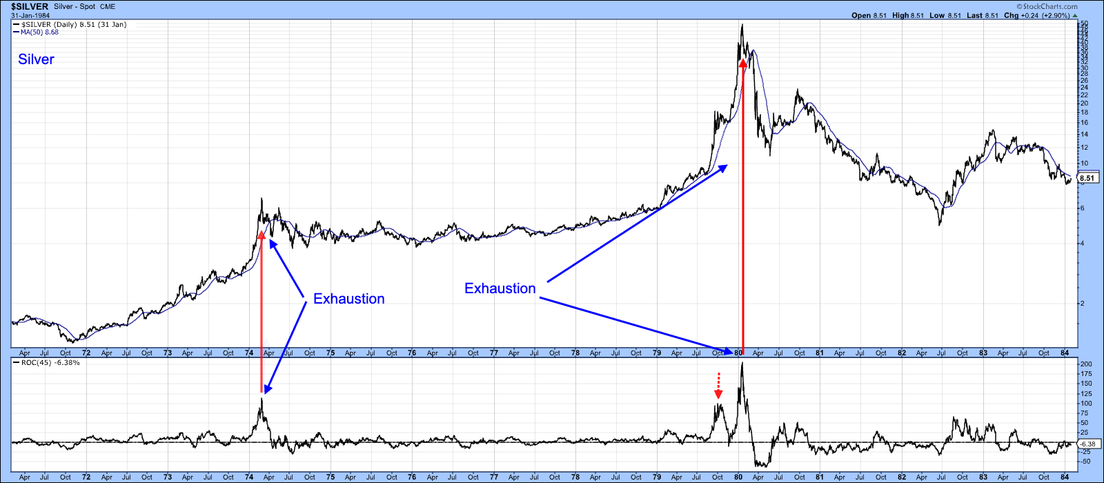
Chart 3 shows two silver peaks that were simply the end of an existing bull market. The momentum peaked after long climbs, and price never crossed a negative 50‑day moving average.
The key difference is timing. When extreme momentum follows deep negativity, it often starts a new rally. When it follows a prolonged rally, it usually warns that the rally may be ending.
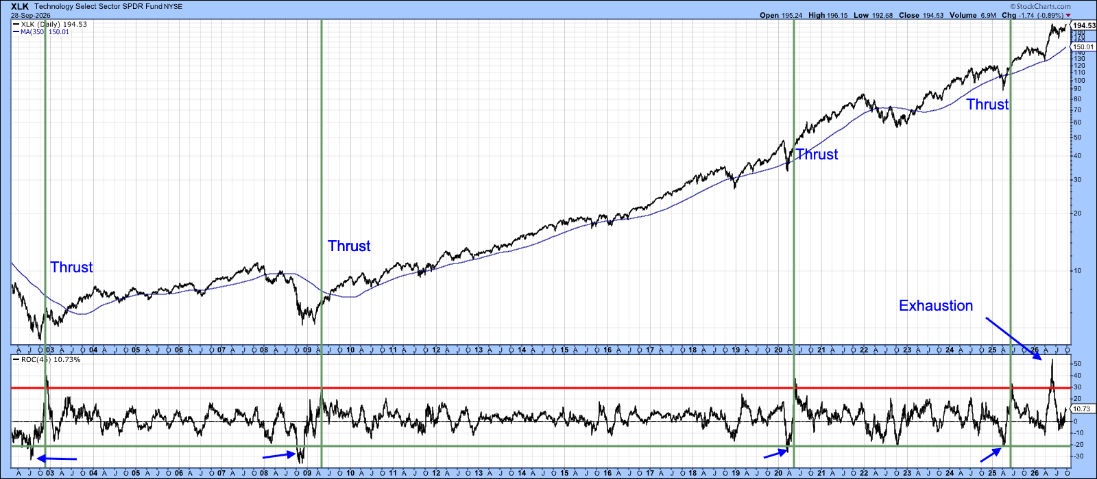
Chart 4 displays four classic thrusts for XLK. Each began with a multi‑year oversold reading and ended with a multi‑year high, followed by strong market gains.
A fifth example in 2026 reached a record high but lacked the prior oversold condition. This makes it look more like exhaustion, suggesting the market may be in the later stages of an advance rather than starting a fresh rally.
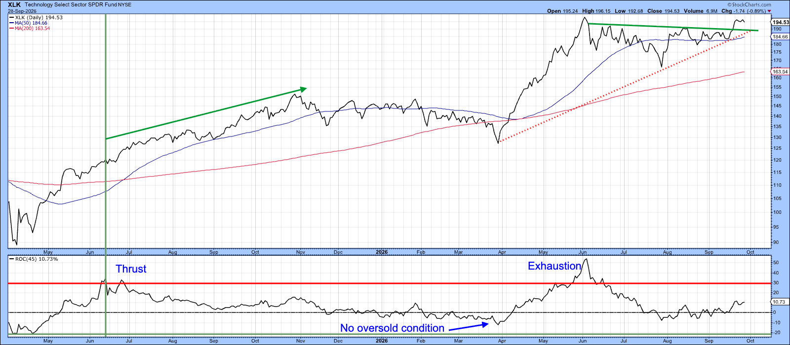
This is just one piece of evidence in a larger analysis. Market turning points are often recognized clearly only in hindsight. The current signal could later be seen as a pivotal moment in the ongoing advance.
Good luck and happy charting.
Source: Materials provided by https://articles.stockcharts.com.Note: Content may be edited for style and length.