

Before we start…
Imagine you are showing a chart in a blog post or a webinar. When you zoom in, the picture looks fuzzy and blocky. That makes the presenter look unprofessional. StockCharts has fixed the problem. SharpCharts now works in High Definition (HD).
Why does the chart look blurry?
When you zoom in on a regular chart, the lines turn into tiny squares called pixels. The more you zoom, the larger each square becomes, and the picture looks jagged.
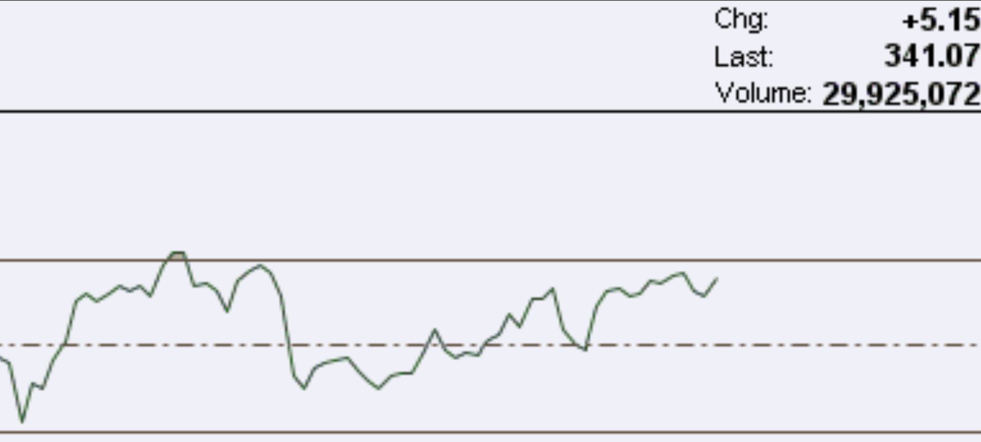
The numbers are still there, but the text and lines are fuzzy. Viewers may think they need glasses.
What HD looks like
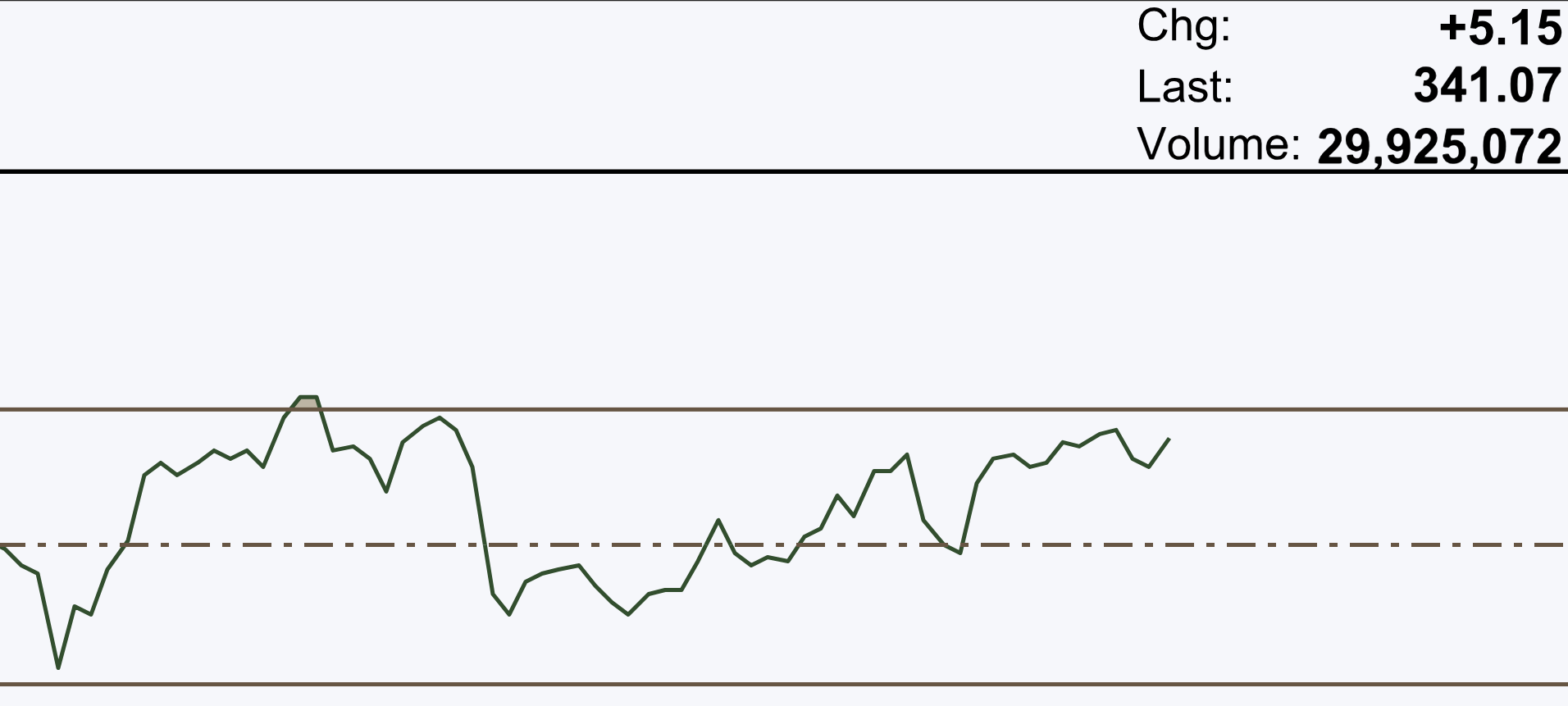
The chart is sharp, and the text is easy to read. Your audience will think the chart is clear, not their eyesight.
A blurry Ichimoku example
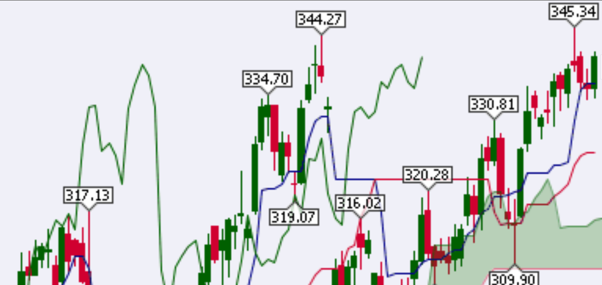
You can see the candles and a few indicators, but everything looks fuzzy.
Same chart in HD
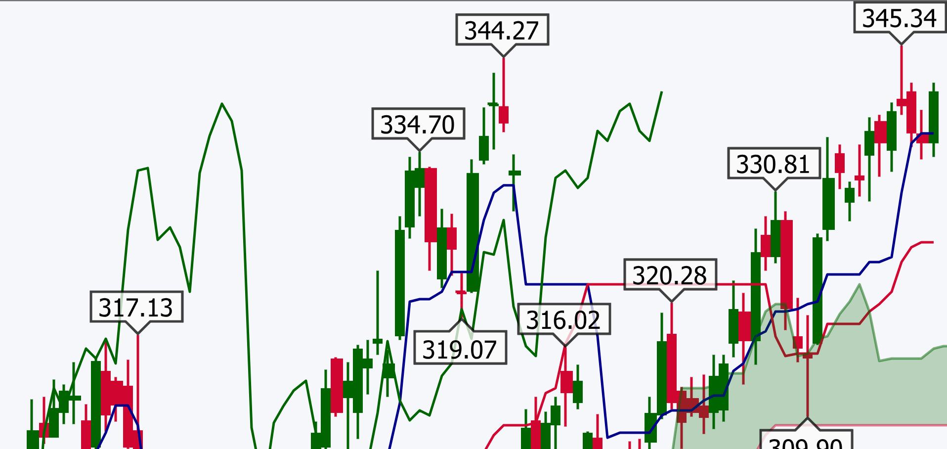
Now every line and number is crisp. Nothing blocks what you want to show.
How to turn on HD charts
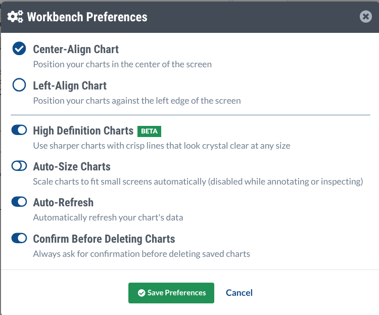
HD mode is still in beta, but you can try it today. Open any SharpCharts chart and click the gear icon (Workbench Preferences) at the top‑right.

Check the box that says “High Definition Charts” and click “Save Preferences”.
If you have ideas about the feature, you can email StockCharts support.
Why does HD work? Meet SVG
Old charts are bitmap images. They are made of many tiny squares (pixels). When you zoom, each square gets bigger, so the picture looks jagged.
HD charts use SVG – Scalable Vector Graphics. Instead of storing pixels, SVG stores drawing instructions like “draw a line from point A to point B”. When you zoom, the browser redraws the chart using those instructions, keeping everything sharp.
A quick history of SVG
SVG was created in the late 1990s. It became an official web standard in 2001, but early browsers (especially Internet Explorer) did not support it, so developers kept using bitmap images.
By 2011 most browsers could show SVG, and a toolkit called D3.js made it easy to build interactive charts. That paved the way for today’s HD SharpCharts.
Insider tip: HD slideshows
If you need to show many charts, open your ChartList, switch to “ChartBook” view, and click the “Presentation” button on the right. With HD turned on, each slide will appear in crystal‑clear quality.

Wrap‑up
SVG took a long road to become part of financial charting, but it’s finally here in SharpCharts. Turn on High Definition, zoom into a chart with many indicators, and see the difference. Your blog readers, webinar attendees, or conference audience will thank you for the clear view.
Source: Materials provided by https://articles.stockcharts.com.Note: Content may be edited for style and length.