

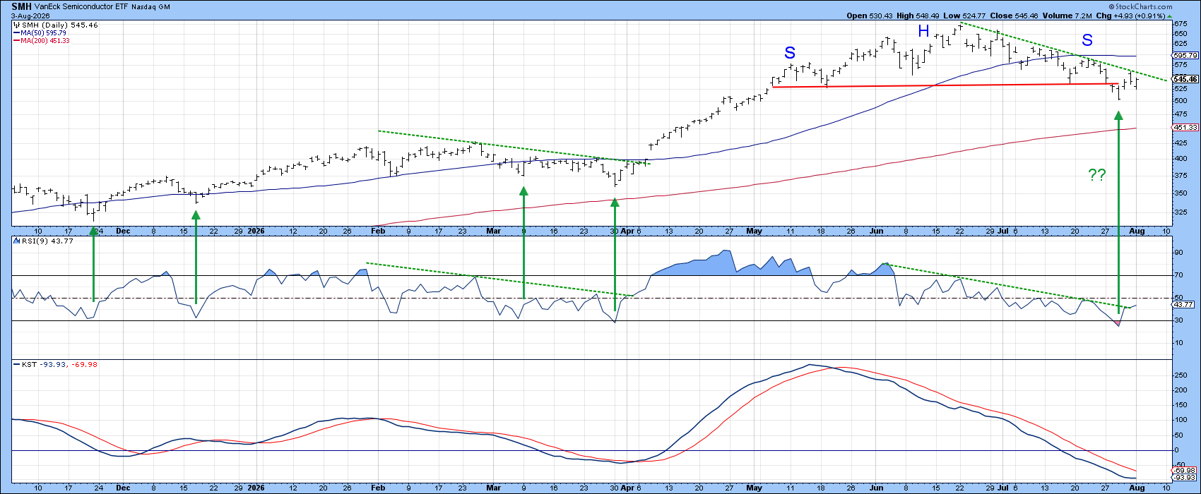
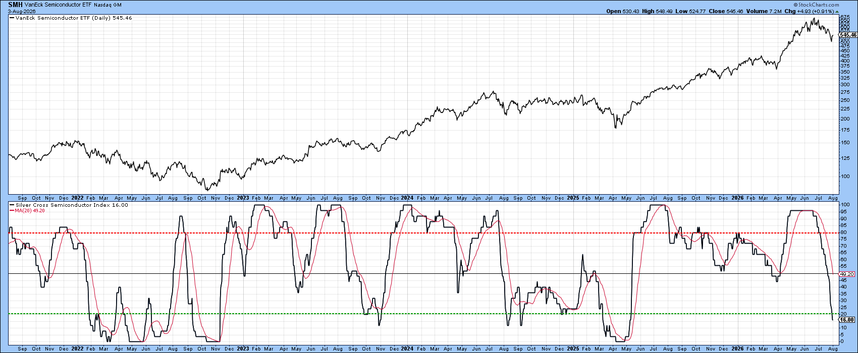
Semiconductor shares have fallen a lot in the last six weeks. The VanEck Semiconductor ETF (SMH) now looks very cheap, which means it may be ready to rise again. The green arrows on the chart show that the last four times the price hit the 30 level, it bounced back with a strong move. This kind of reaction often happens when a market is still in a bull phase.
It is also possible that the recent drop after the May head‑and‑shoulders pattern is just a short‑term wobble. To prove this, SMH and its 9‑day Relative Strength Index would need to climb above the two green trend lines, just like they did in early April. Back then, the Know Sure Thing (KST) gave a buy signal, completing a solid technical setup. Although the KST is now below its average line, a small push upward could trigger another buy signal.
Long‑Term View
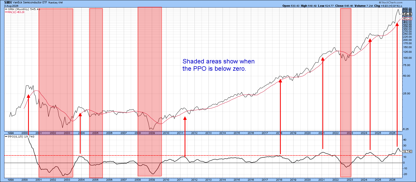
Chart 3 looks back to the year 2000 and uses a Percentage Price Oscillator (PPO) with 6‑ and 15‑period settings. The pink background marks areas where the PPO falling below zero often signals trouble. Those zones have caught most major drops in the past 25 years.
Right now the PPO is far from crossing below zero, so a bearish warning is unlikely soon. However, history shows that the indicator sometimes flips lower after climbing above the red overbought line. This has happened six times since 2000, each time followed by a big fall or a long trading range. This year we saw a seventh flip from a level that was only topped once before, during the tech boom.
Is Momentum Fading?
Chart 4 compares SMH price with its 13‑week Rate of Change (ROC). The price keeps rising above its 40‑ and 65‑week averages, showing a clear uptrend. What catches the eye is the ROC, which recently hit a peak beyond its usual high zone.
Such a reversal is rare—only four times since 1999. When it appears, it usually signals either a strong bullish push or a sharp bearish warning.
A bullish signal often comes in two steps. First, the market climbs out of a deep oversold area (the green dotted line). Second, the ROC peaks above the blue dotted line, indicating a shift from heavy pessimism to strong optimism—typical of a young bull market.
The opposite signal happens when the ROC reaches an extreme after a long rise, pointing to buyer fatigue. This pattern is generally bearish and should be taken seriously, especially since the latest peak was the second‑highest ever recorded.
Takeaway
While this single indicator does not confirm a major bear market, it does raise a caution flag. Traders should test any short‑term rally to see if it still follows a strong, healthy trend.
Source: Materials provided by https://articles.stockcharts.com.Note: Content may be edited for style and length.