
Some traders think the S&P 500 is showing a classic head‑and‑shoulders shape. It actually looks more like a symmetrical triangle, also called a coil pattern. This shape shows that buyers and sellers are stuck in a tie.

A up‑trend means higher highs and higher lows. A down‑trend means lower lows and lower highs. When the market makes lower highs but higher lows, it is just pausing – a neutral zone called a consolidation phase.
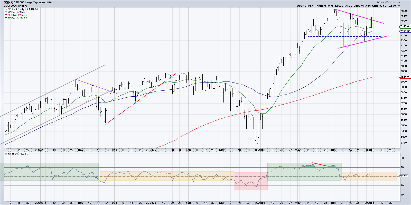
This triangle stays quiet until the price breaks out either up or down. The break is usually supported by stronger momentum and higher trading volume. If both happen, the move often continues in that direction.
Traffic‑Light View of Key Levels
To see where the market might go, we can draw a traffic‑light picture. Green shows strong support, yellow shows a warning zone, and red marks a level that could trigger a fall.
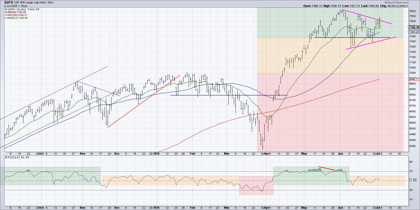
If the index drops below 7,340, the triangle would break down, showing weak buying. Falling further to around 6,950‑7,000 would test the 200‑day moving average, a line that often signals a full “risk‑off” mood.
How the Short‑Term Pattern Fits a Bigger Picture
We look at three time frames – short, medium, and long – to see the overall trend. In June, the short‑term view turned bearish for the second time since March. The medium and long‑term views stayed bullish.
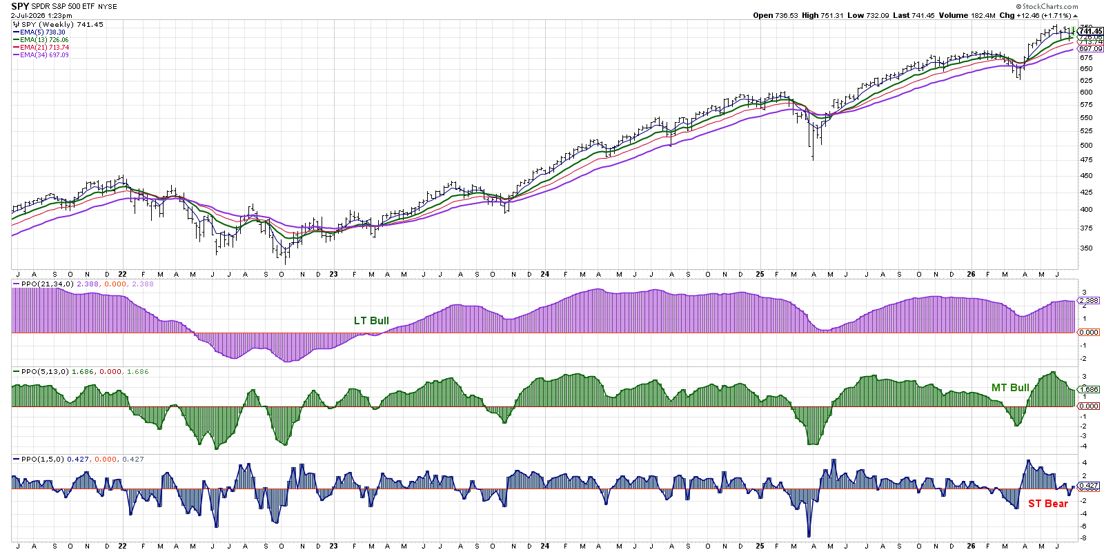
That means the recent wobble is likely a short‑term correction inside a longer‑term uptrend. If the support zones mentioned above are broken, the medium‑term outlook could also turn negative.
When the coil finally decides which way to go, we will have a clearer idea of market conditions heading into the earnings season in mid‑July.
Disclaimer: This material is for educational purposes only and does not constitute financial advice. Always consider your own situation and consult a professional before making investment decisions.
Source: Materials provided by https://articles.stockcharts.com.Note: Content may be edited for style and length.