

As a long‑time chart reader, I love clear breakouts that come with strong volume. Last week the Dow Jones Industrial Average and the Value Line Geometric Average both seemed to break out upward, but each quickly fell back below their resistance levels.
What a False Breakout Means
When a breakout fails, the price can act in two ways. It may bounce back up and make new highs, or it may turn down sharply. The second outcome is more common when the move was weak.
Why does this happen? Late buyers get trapped near the top. When the price drops, they have to sell, adding more pressure. New short sellers then join, pushing the market lower.
A false breakout is just one clue. Before assuming a big down move, traders should wait for solid proof, like a clear break of a trendline or a moving‑average crossover.
Dow Jones and Value Line Overview
Chart 1 shows a classic false breakout on the SPDR Dow Jones ETF (DIA). In early February the price rose above a key trendline, then fell back below the line and its 50‑day moving average, starting a short‑term decline.
Last week DIA tried again, this time crossing a second dashed resistance line. The move was rejected, and a bearish outside bar formed on Wednesday. The RSI also peaked in early June and then failed to support a higher high, creating a clear bearish divergence.
However, the main uptrend line just above $505 is still intact. Until that line breaks, the false breakout is only a warning, not a definite reversal signal.
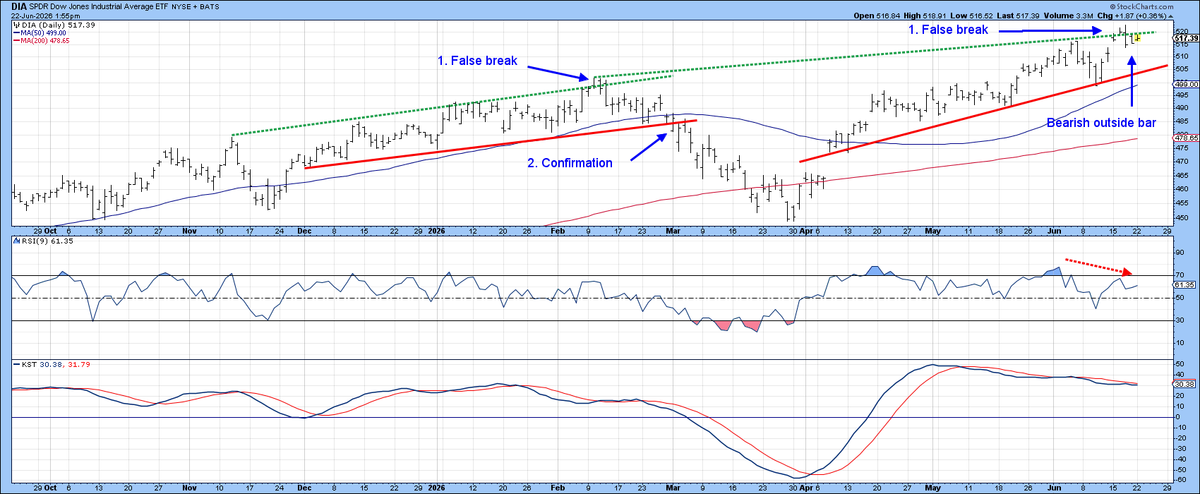
Chart 2 tracks the Value Line Geometric Average, a broad “average stock” indicator. Its recent breakout is more serious because the resistance line has been tested many times.
Strong support sits near 658, where the red trendline meets the 50‑day moving average. Watch this level for a real trend change. Meanwhile, the RSI is making lower peaks even as the index climbs, showing a bearish divergence.
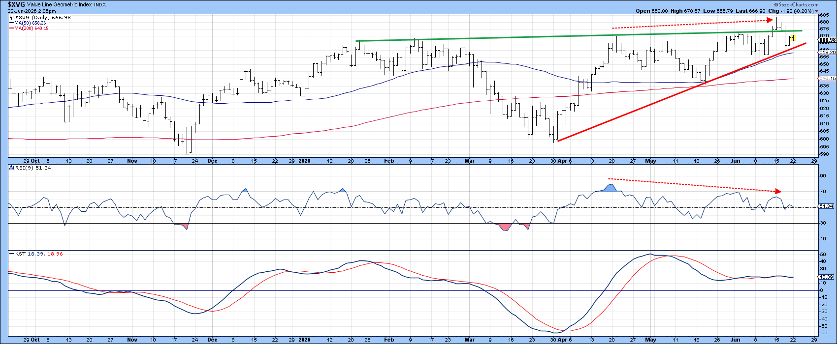
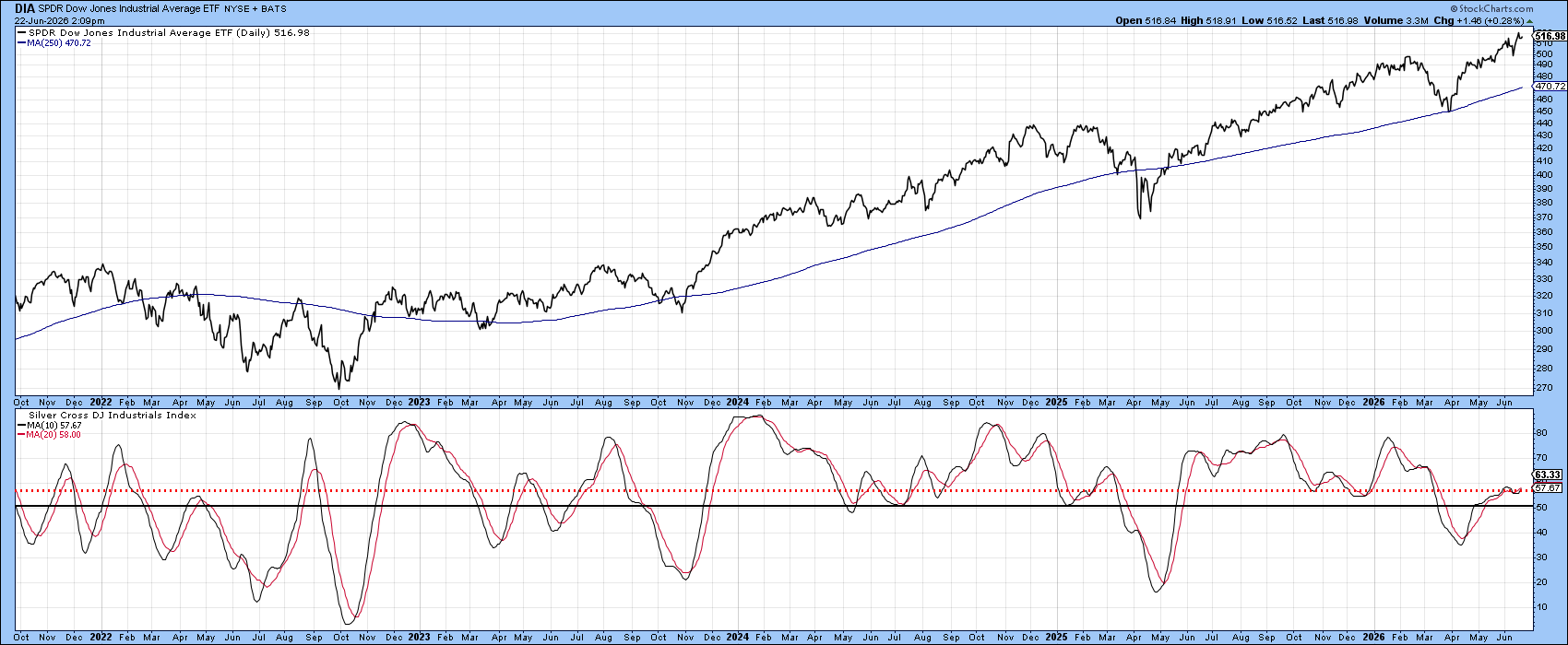
Chart 3 measures market breadth by the percentage of Dow stocks with a positive “silver cross” (20‑day EMA above 50‑day EMA). The chart smooths the data with a 10‑day moving average.
Even though the Dow set a new record high, the breadth indicator barely rose above its 50 % midpoint. This low participation suggests the rally lacks wide‑spread support.
If the false breakout in Chart 1 turns into a true break, the weak breadth makes a sharp decline more likely.
Stay aware and keep your charts close.
Source: Materials provided by https://articles.stockcharts.com.Note: Content may be edited for style and length.