
Before we start…
Swing charting is a simple way to see the hidden shape of a market trend. Think of a building: no matter how fancy it looks, it needs a strong foundation. Swing charting looks for that foundation in price moves.
You can read the full theory elsewhere, but here we’ll focus on why it works and how to add a few extra tools.
The market gives you too much data
If you have no data, you trade blind. If you have too much, you get confused. Prices wiggle all the time, and news adds more noise. The trick is to find what really matters.
Just like a house has a simple base under all the fancy rooms, a market has a simple base under all the noise. Swing charting ignores tiny moves and most of the clock‑time. It only looks at the big moves that hold the trend together.
How swing charting filters the noise
In this method you only need two things: the most important swing highs and swing lows.
Why? Because an uptrend is made of higher highs and higher lows, while a downtrend shows lower lows and lower highs. Anything else is called a "non‑trending" phase.
What makes a swing point “key” depends on the time frame you care about. Once you have those points, the clutter fades away.
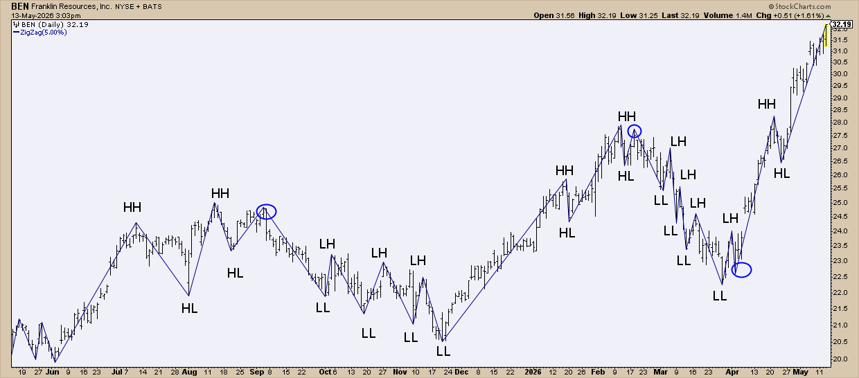
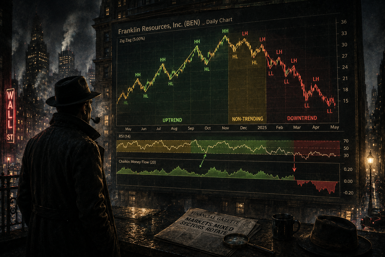
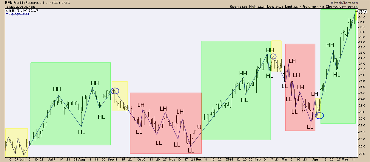
To pick the swing points I used a Zig Zag tool set to 5 %. It only draws points that move more than 5 %. You can see higher highs (HH), higher lows (HL), lower lows (LL) and lower highs (LH).
Green sections show an uptrend, yellow means the market is moving sideways, and red marks a downtrend.
Different tools can also find trends – moving averages, Bollinger Bands, Ichimoku clouds, and so on. Swing charting is a very plain method, but it works well for many traders.
Using swing points for breakouts
Swing highs often act like resistance; swing lows act like support. When price breaks above a swing high and stays there, it usually means the market is confident. The opposite happens with a break below a swing low.
Insider tip #1 – Use swing highs for bullish entries and swing lows for stop‑losses
If a stock is in an uptrend and pulls back, a buy order a few points above the last swing high can be a good entry. If the price falls back below the swing low, that level is a logical place for a stop‑loss.
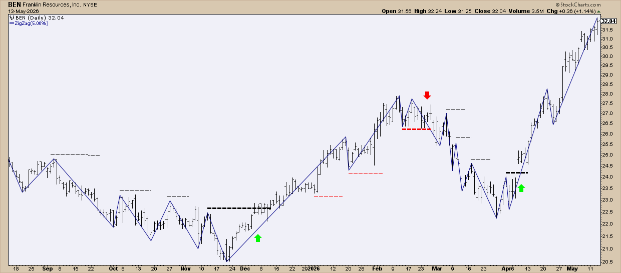
The thin dotted lines are orders that never triggered. The thick green arrow shows where a buy stop finally hit. The thick red arrow shows where a trailing stop closed the trade.
Insider tip #2 – Combine swing points with momentum and money‑flow indicators
Seeing a swing point is helpful, but you also want to know if momentum supports it and if money is flowing in.
Look at a gold ETF (GLD) chart:
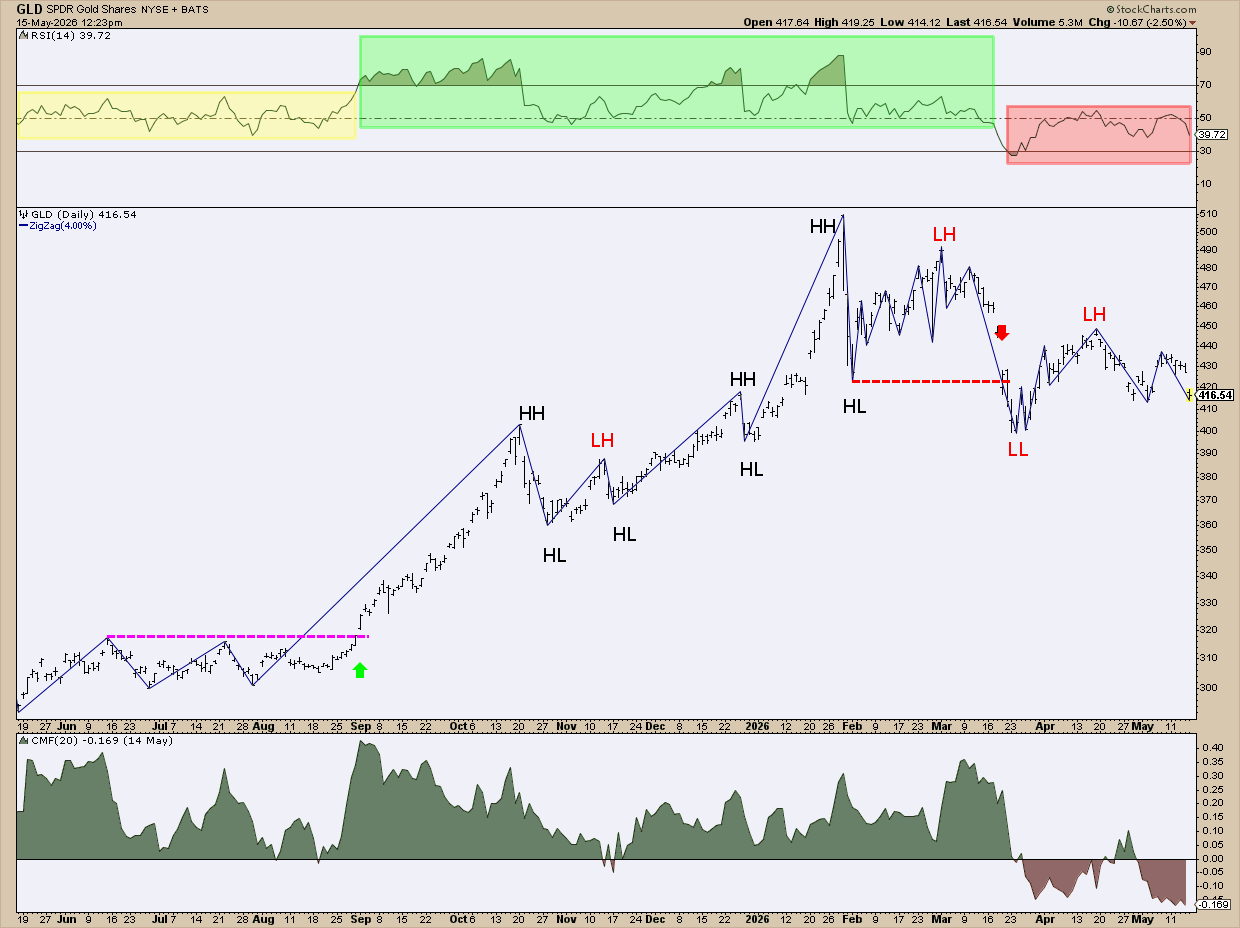
The magenta line marks a breakout above a consolidation zone, starting a new uptrend with higher highs and higher lows. Later, a lower high created a triangle that broke upward.
When the trend stayed strong, the Relative Strength Index (RSI) moved into a bullish zone. When the uptrend failed in March, the RSI turned bearish, and the Chaikin Money Flow (CMF) slipped below zero, showing selling pressure.
Wrapping it up
Swing charting is both a model and a strategy. It may feel slower, but that slowness helps you avoid mistakes. It strips away the noise and shows the real structure of a trend. When you look at charts this way, they become easier to read and you stay focused on what truly matters.
Source: Materials provided by https://articles.stockcharts.com.Note: Content may be edited for style and length.