

Big market indexes are looking stronger again, but the story is a bit more detailed than the headlines. A new viewer of my daily market recap asked which breadth measures work best.
He wondered which of the many tools—Advance‑Decline lines, new highs and lows, percent above the 50‑day, or the Bullish Percent Index—are the most useful.
This is a great question because it shows he wants to improve his investing habits. It also tells me that the reminder to "pay attention to market breadth" is getting through.
I keep a short list of five breadth metrics, but three of them are the core of my daily routine.
Cumulative Advance‑Decline Line: A Basic Guide
When I first learned technical analysis, I saw that looking at the S&P 500 chart alone misses a lot of information. Breadth shows how all the stocks inside an index are behaving.
The cumulative Advance‑Decline (A‑D) line adds up the daily net number of advancing stocks. By doing this, it smooths out daily noise and shows the real trend of market participation.
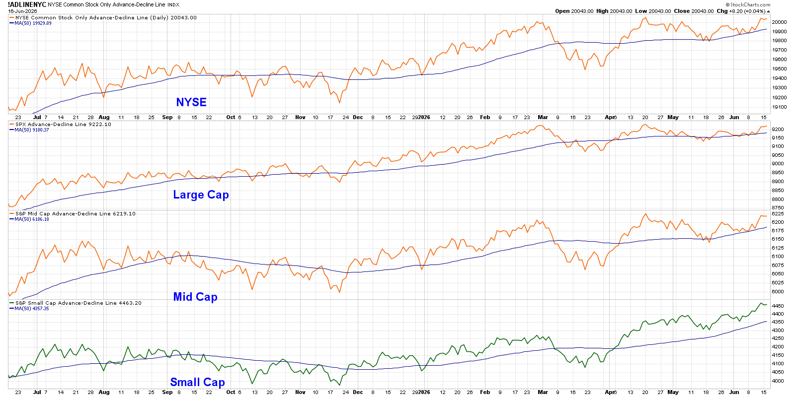
If the main indexes keep climbing while the cumulative A‑D line flattens or slopes down, it means only a few big stocks are doing the heavy lifting.
For example, if the S&P 500 reaches a new high but the A‑D line does not, the rally may be weak.
McClellan Oscillator: Spotting Short‑Term Changes
The cumulative A‑D line is my long‑term compass. The McClellan Oscillator helps me see shorter‑term shifts.
It is created from the slope of the NYSE Advance‑Decline line and smooths the data with exponential moving averages. The result is a clear picture of momentum inside market breadth.
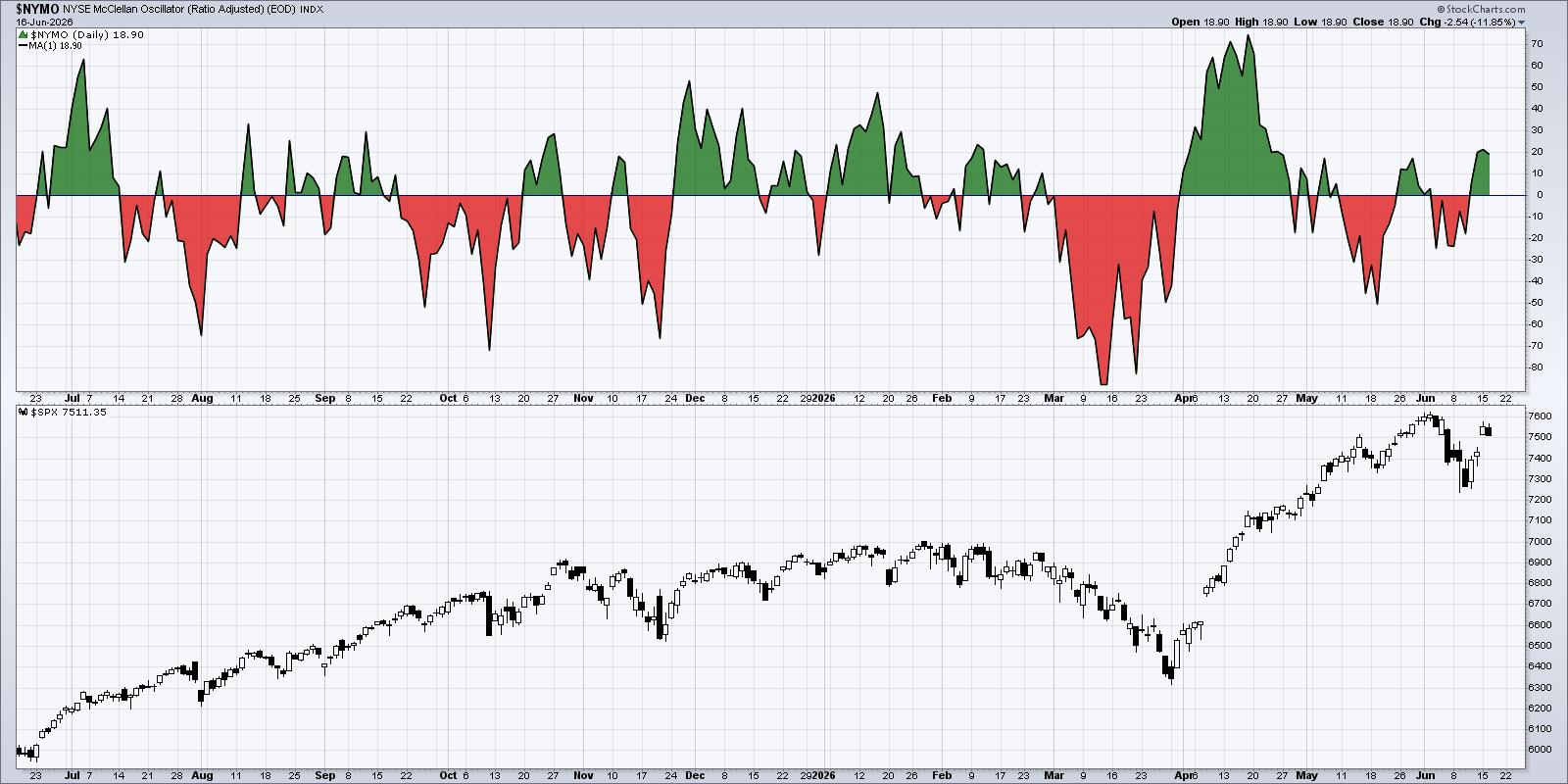
When the oscillator moves from negative to positive, it signals that breadth is improving and the market may be ready to rise again. The opposite move can warn of a short‑term pullback.
Stocks Above 50‑Day and 200‑Day Averages
The third tool I watch is the percentage of stocks trading above their 50‑day and 200‑day moving averages. These two averages act like speed limits for individual stocks.
In a healthy bull market, many stocks should be above these lines. If the overall index is climbing but only a few stocks are above their averages, the rally might be fragile.
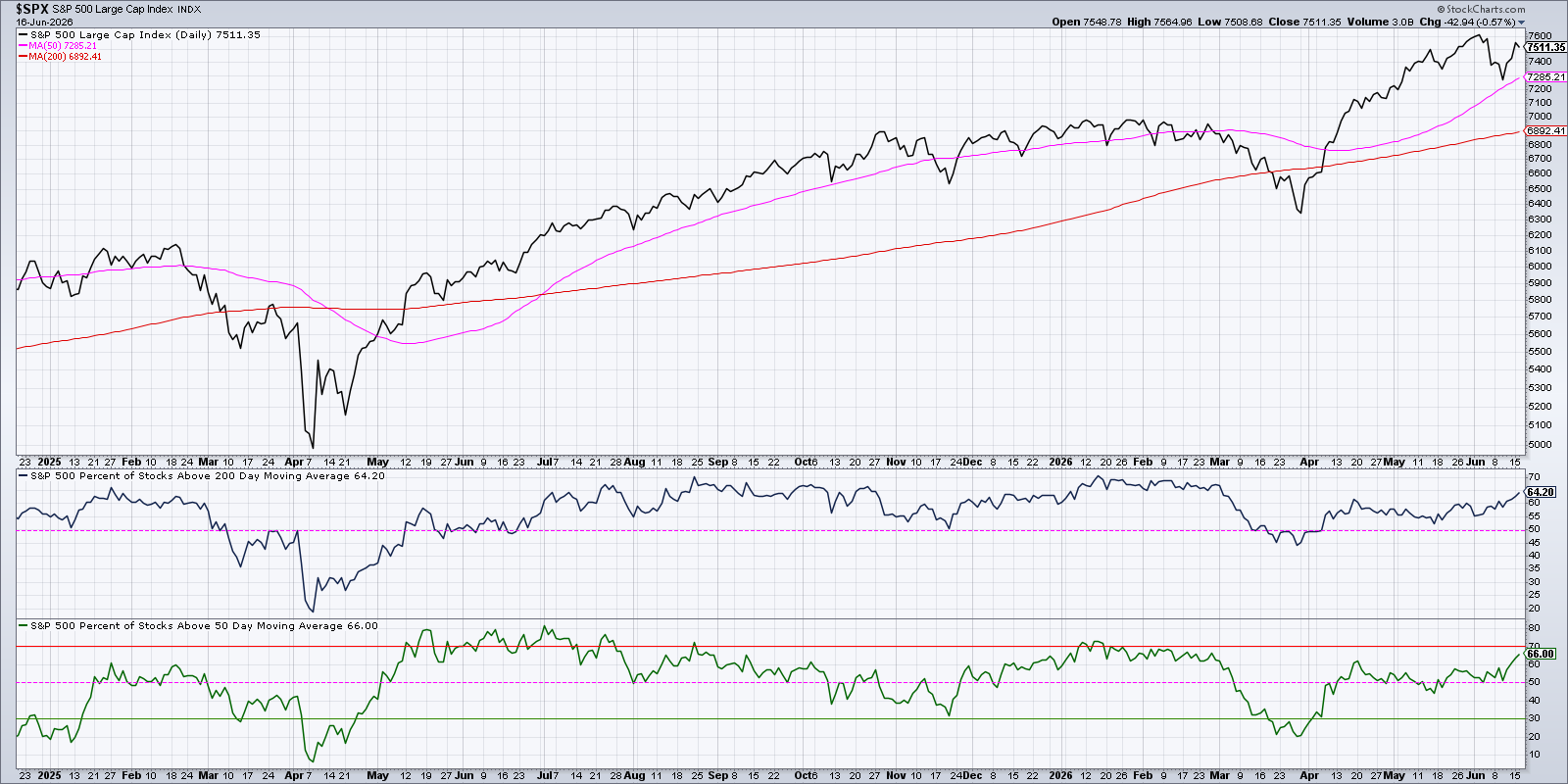
Even when tech stocks wobble, these breadth percentages have stayed above 50 % since mid‑May, showing that other sectors are still strong.
By combining the long‑term view from the cumulative A‑D line, the short‑term momentum from the McClellan Oscillator, and the trend confirmation from moving‑average percentages, you can build a solid framework for market decisions.
Source: Materials provided by https://articles.stockcharts.com.Note: Content may be edited for style and length.