


Long‑term market moves change very slowly. When they do turn, it takes a lot of time and effort. I try to let the data, not my feelings, guide my choices.
Right now the data still points up, but higher interest rates and inflation make the picture hazy. I’m starting to wonder if the first domino has already fallen.
Chart 1 compares the S&P 500 (adjusted for CPI) with the 12‑month rate‑of‑change (ROC) of the CPI. The red line at 3.5 % marks the point where inflation usually starts to hurt stocks. Every time the ROC crosses that line, a red arrow shows that equities have felt pressure afterward.
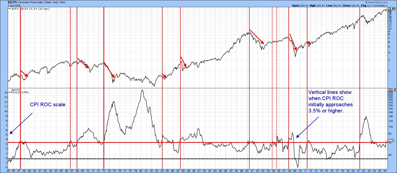
The pain level changes each cycle, depending on the economy and how strong the inflation spike is. Markets sometimes wait to react, as they did in 2022, but the pattern stays the same: once the ROC climbs above 3.5 % and keeps rising, inflation becomes a headwind for stocks.
The breach happened in April. New data will be released this Wednesday, so you can refresh the chart later.
Chart 2 puts the NYSE Composite next to its 14‑month Relative Strength Index (RSI). Red vertical lines mark when the RSI moved from overbought to bearish territory—events that often precede a decline. The dashed arrows show periods of indecision that usually end in sideways trading.
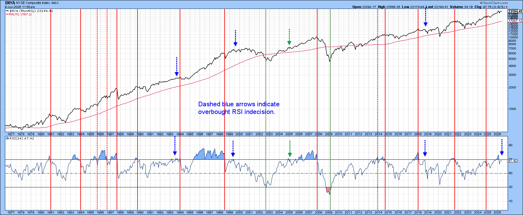
Earlier this year the RSI turned down, but it quickly jumped back into overbought levels. That tells us the market is more likely consolidating than breaking out in either direction. The earlier risk‑reward edge has faded, so traders should stay alert.
Chart 3 looks at two advance‑decline (A/D) lines beside the S&P 500. It shows a quiet but important gap: the headline numbers look strong because tech stocks are doing well, yet the breadth indicators have not confirmed the early‑June all‑time high. This small crack suggests the rally may be resting on a thin base.
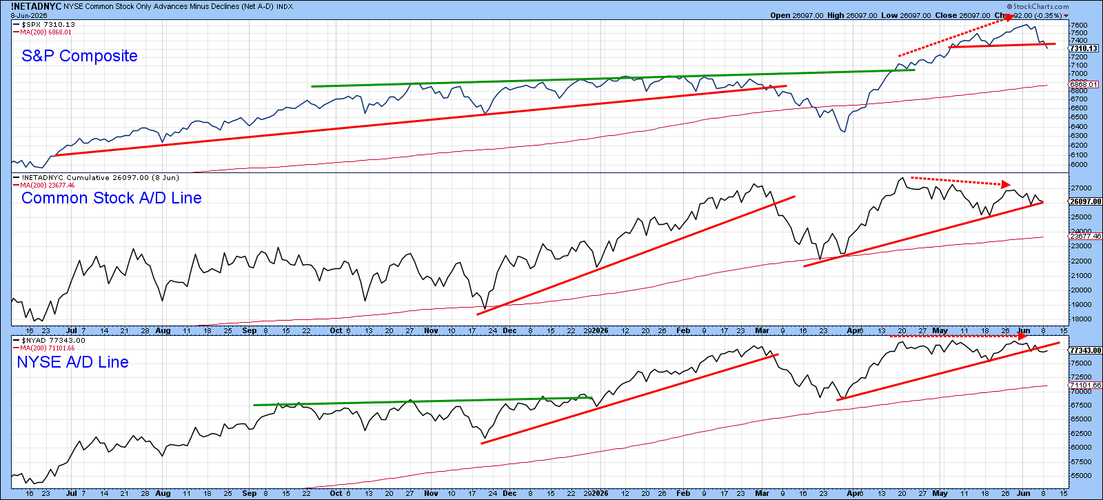
Chart 4 compares the NYSE Composite to the percentage of stocks trading above their 20‑day EMA. Even though the index made a fresh intraday high last week, the indicator barely nudged past 55 %, a sign that many stocks are still lagging.
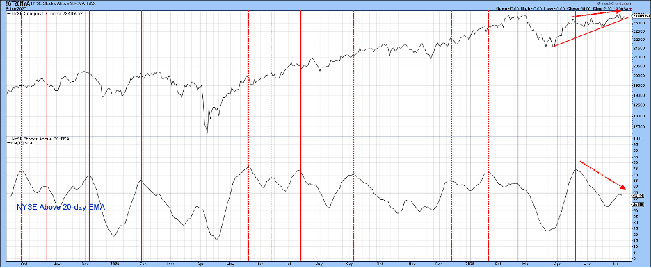
Chart 5 shifts the view to the percentage of NYSE stocks above their 200‑day moving average. This broader measure has been slipping even as the index climbs, a quiet warning sign that the rally may lack depth.
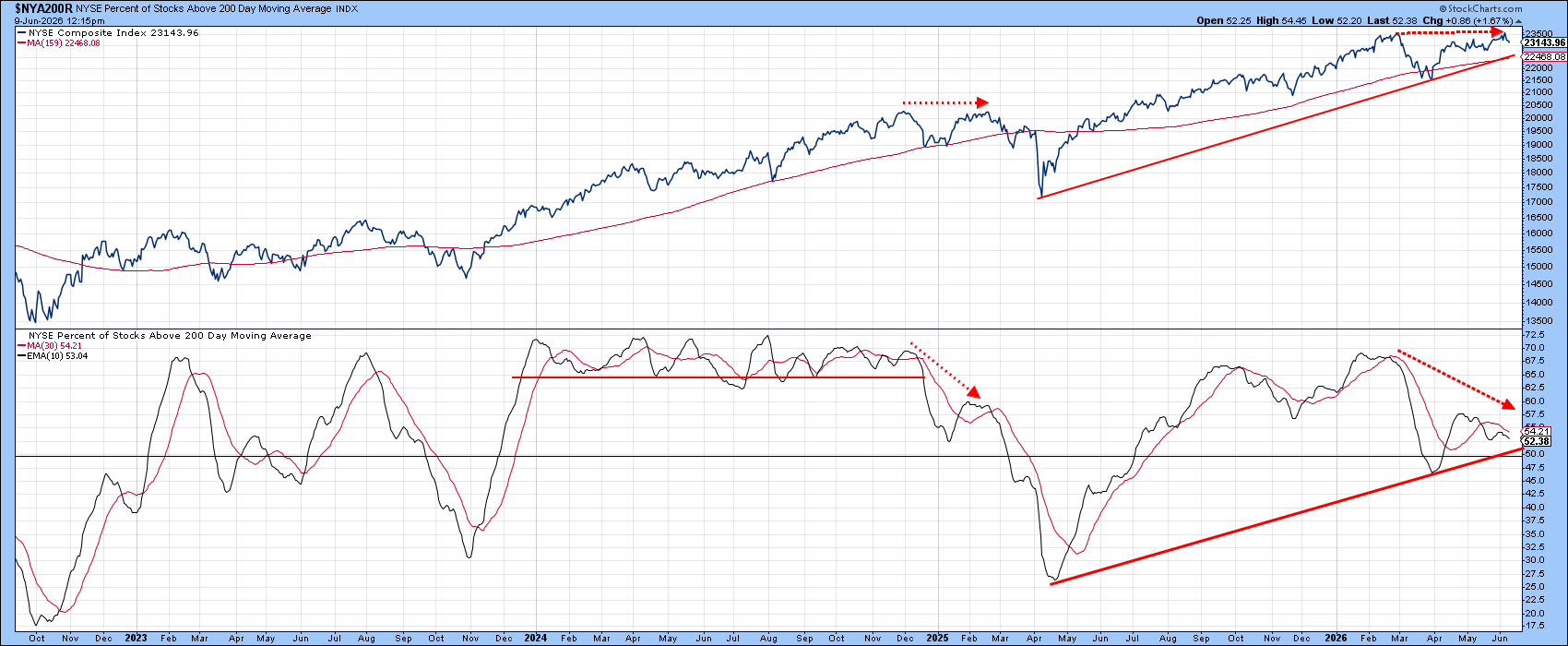
Until the S&P 500 itself breaks down, these signals remain warnings, not verdicts. A decisive test will be a fall below the rising trendline and the 200‑day average, both of which converge near the 22,500 level.
The recent rally has been driven largely by technology stocks. The breadth charts underline how narrow that advance has been.
Chart 6 focuses on the XLK technology ETF, which printed a bearish outside bar last week. Looking at the two weeks before, this pattern could be the second leg of a two‑bar reversal, hinting at buyer fatigue.
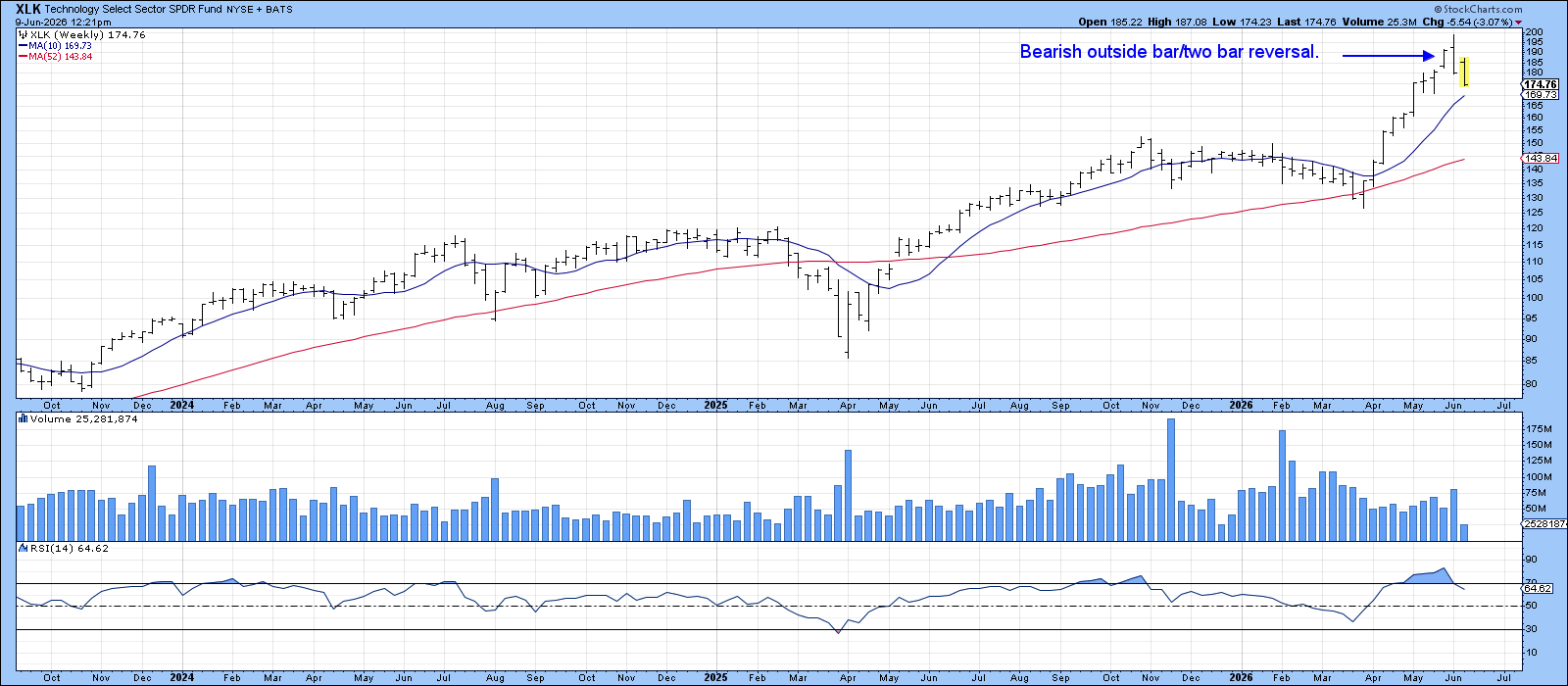
Outside bars usually affect price for the next 5‑10 bars—here that means several weeks. The bar was wide, showing a fierce tug‑of‑war, but sellers won, closing at the low. A break below the 10‑week moving average at $170 would confirm the weakness.
With a record‑setting IPO on the horizon, technology could see a big peak soon. Perhaps the first domino has already dropped.
Source: Materials provided by https://articles.stockcharts.com.Note: Content may be edited for style and length.