

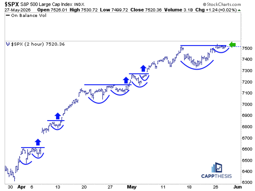
The S&P 500 rose about 17% in just eight weeks. That is one of the fastest eight‑week moves ever recorded. At first it looks like a single, strong rise, but inside the climb there are short pauses that act like tiny boxes.
When we zoom in to a 2‑hour chart we see four clear bullish breakouts. Each breakout pushes the price higher, then a short “digest” phase follows, which also ends higher. The pattern repeats.
Right now a new bullish setup is forming. It is the biggest one we have seen so far.
If you measure from the high on May 14 to yesterday’s high, the shape looks like a multi‑day cup‑with‑handle. If the price breaks out of this shape, the next target could be around 7,750 points. That target is modest, but it sits above the current bull‑flag target, adding confidence that the market could reach it.
This helps explain why the market still moves up even though the early surge was more explosive. The same type of pattern can keep the uptrend alive for longer.
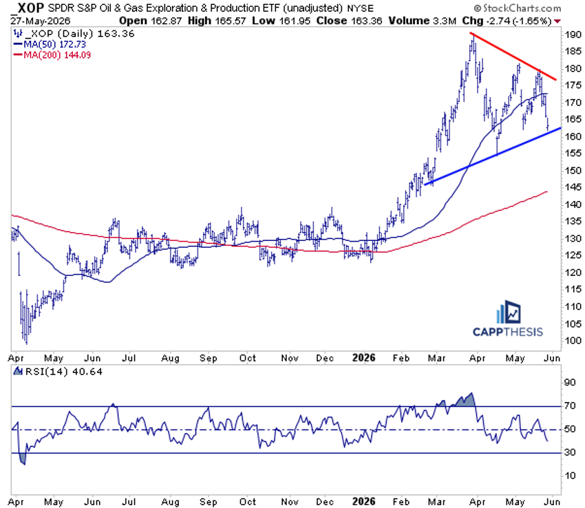
XOP Oil & Gas Exploration – Volatile Price Action Continues
The SPDR S&P Oil & Gas Exploration & Production ETF (XOP) fell about 2% on Wednesday. The price slid back to the uptrend line that started at its February low. A large symmetrical triangle has formed over the past few weeks after the recent top.
Most moves are driven by news headlines, making the price swing back and forth without a clear direction. Because of this, neither bulls nor bears have strong conviction yet.
Short‑term traders can still try to catch the small bounce‑backs, but a clearer trend may need more time to develop.
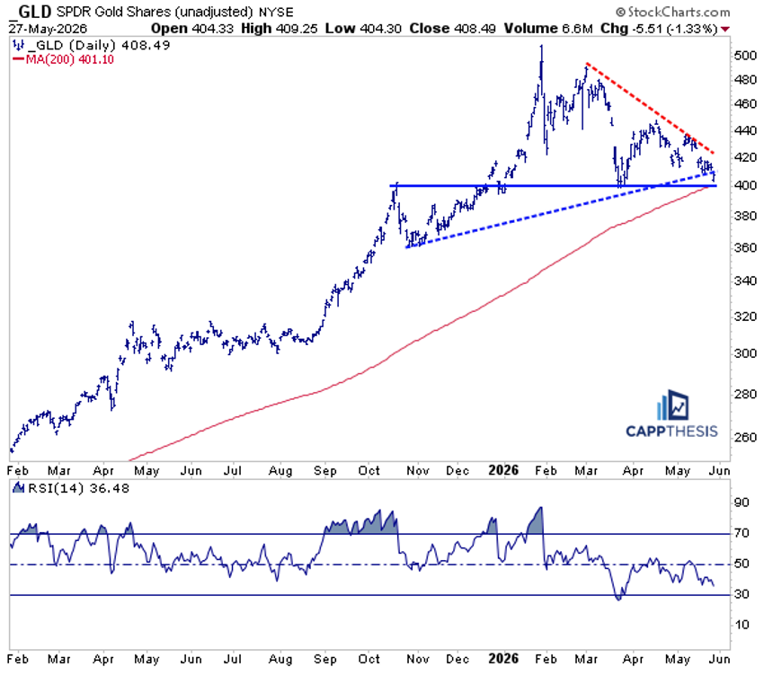
GLD – Staring at Key Support
The same back‑and‑forth pattern we saw in XOP is now appearing in gold. The SPDR Gold Shares (GLD) has been drawing a large triangle, and yesterday it slipped just below the lower trend line.
This area near 400 points also lines up with support from March, December, and early October. The 200‑day moving average sits at about 401, giving a strong confluence of support.
Long‑term, GLD stays in an uptrend. The recent pullback brings it back to a meaningful support zone. Buyers who missed earlier moves might consider re‑entering here. A firm break below 400 would raise risk, so many traders would place a stop just under that level.
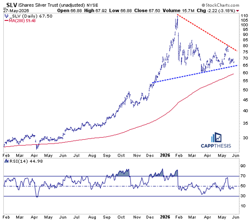
SLV Silver – A Similar Scenario
The iShares Silver Trust (SLV) shows a comparable picture. It sits a little higher than its 200‑day moving average, which is just below 60.
Silver has tried to bounce several times in recent weeks but each attempt fell short of the 80‑point zone. Buyers have stepped in at slightly higher levels, preventing a big drop and keeping a topping pattern from fully forming.
Both GLD and SLV now sit near important support lines. Buyers may step back in, using a tight stop just under the 60‑point level to manage risk.
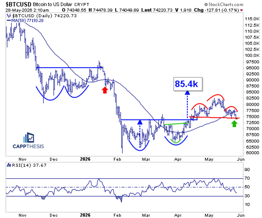
Bitcoin – Teetering
Bitcoin stopped its strong May rally and fell below its 50‑day moving average. It now hovers around the 72,000‑75,000 range.
This range was the breakout zone of the cup‑with‑handle pattern that formed in early April. That pattern suggested an upside target near 85,400, but the move slowed and peaked around 82,500 before turning down.
A bearish head‑and‑shoulders pattern is now forming, with the price testing the neckline while revisiting the earlier cup‑with‑handle zone. A clear break lower could signal a larger trend reversal.
The 14‑day RSI has dropped to about 37, the lowest since late February. Momentum is weak but not yet oversold, so the next move from this support area will be important.
Source: Materials provided by https://articles.stockcharts.com.Note: Content may be edited for style and length.