

The NYSE‑to‑S&P 500 ratio might be breaking its three‑year ceiling. This tiny change could mean a big shift in how the market works.
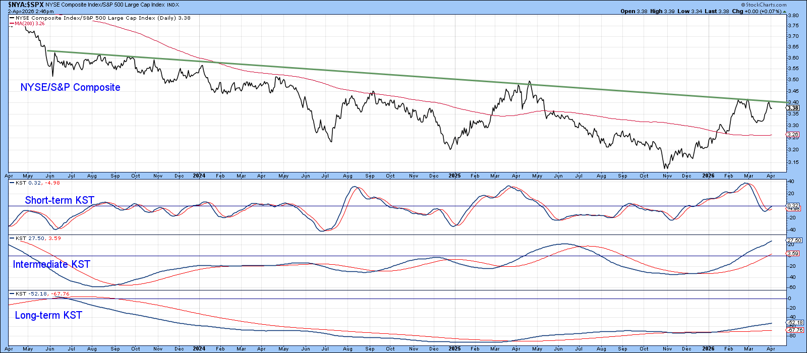
Our first picture shows the NYSE/S&P 500 ratio pressed just under a resistance line that has lasted three years. The line is important because the ratio has tried and failed to cross it about ten times since 2023. Its gentle down‑slope makes it act like a strong ceiling.
Two things make this moment stand out. First, all three KST momentum indicators are pointing up, which means short‑, medium‑, and long‑term trends all agree on a possible breakout.
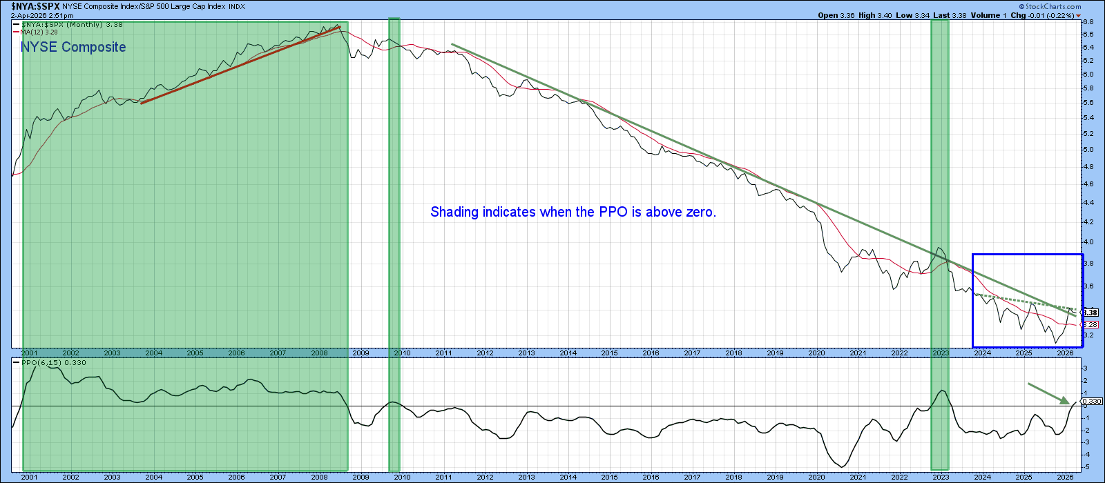
Second, the second chart shows that NYSE’s relative weakness has been growing since the 2008 financial crisis. The blue box marks the recent move that is only a small part of a long‑term downtrend. If the monthly close moves above the green line, the three‑year base would finish and the long‑term downtrend would be broken.
The Percentage Price Oscillator (PPO) has just nudged above its middle line. It’s a small positive sign, but we won’t rely on it alone.
What Would a NYSE Turnaround Mean?
If the NYSE Composite begins to beat the S&P 500 for several years, it would change the market’s story.
The NYSE Composite includes all common stocks on the New York Stock Exchange – about 2,800 firms, many of them foreign. Roughly one‑third of its value comes from international companies.
The S&P 500, on the other hand, holds 500 large U.S. companies, with tech giants like Nvidia, Apple, Microsoft, Alphabet and Amazon making up a big share.
A lasting NYSE lead would suggest those tech giants might stop pulling the market higher. Two main effects would follow.
First Effect: Tech Stocks May Lag
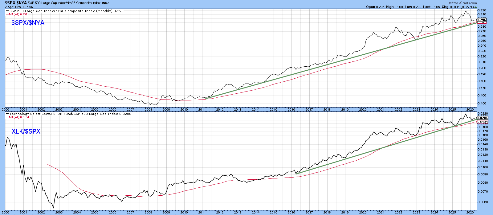
When the S&P 500 outperforms the NYSE, technology ETFs usually beat the market. The third chart flips this view by plotting the S&P 500 against the NYSE. A falling ratio would likely mean tech will underperform for years.
Second Effect: Foreign Stocks Could Shine
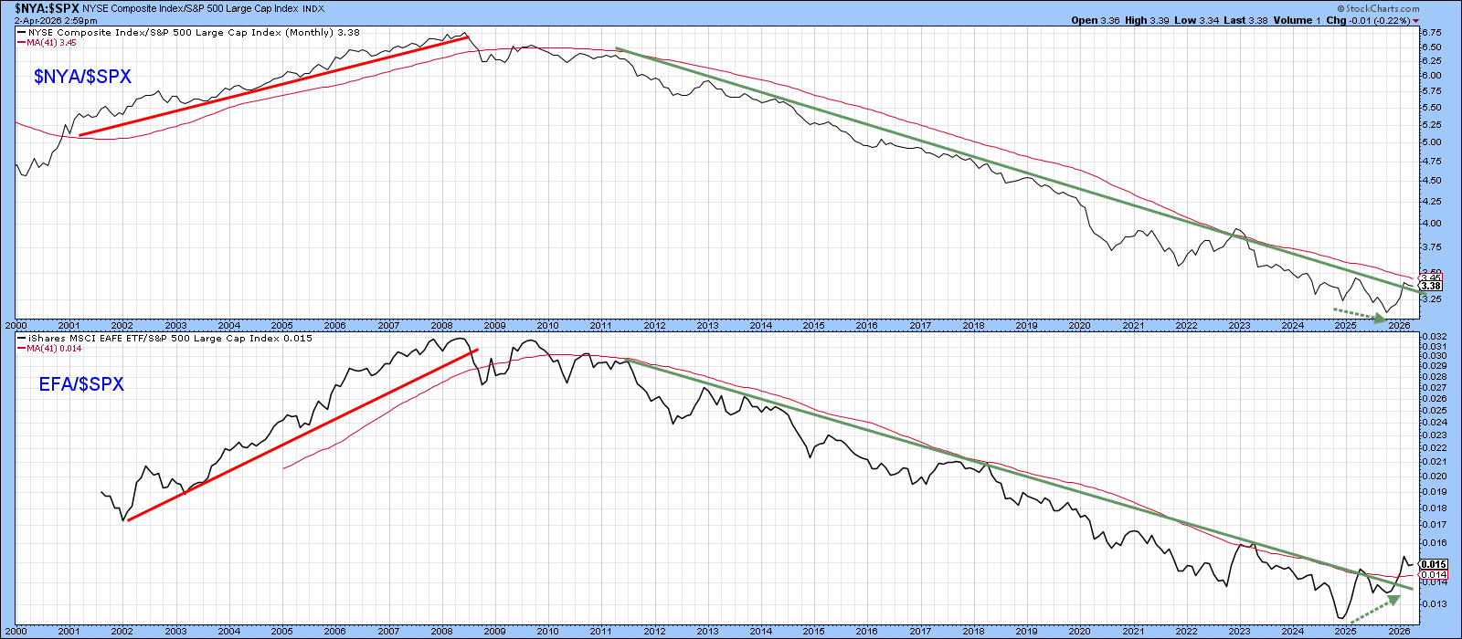
The NYSE Composite holds many ADRs, so a NYSE surge often lifts overseas companies. The fourth chart compares the NYSE/S&P ratio with the Europe‑Australia‑Far East ETF (EFA) versus the S&P 500. The two lines usually move together.
Right now, the EFA/S&P ratio has already broken its long‑term downtrend, pulling away from the NYSE/S&P line.
Bottom Line
Watch the NYSE/S&P ratio closely. A break could signal a long‑term turn that favors tech stocks less and gives a boost to international equities.
Source: Materials provided by https://articles.stockcharts.com.Note: Content may be edited for style and length.