


Right now the stock market moves with every new headline. That makes it hard to feel sure about buying or selling.
When news pulls the market in opposite directions, many investors freeze. Instead of chasing every story, you can let charts show what is really happening.
For example, on Thursday the S&P 500 fell below its 200‑day moving average early in the day, then climbed back up and closed just under that line. Those mixed signals can be confusing, but a simple chart routine can keep you calm.
Build a Pre‑Market Chart List
Before the market opens, take a few minutes to look at a set of key charts. Think of it as a personal dashboard that gives you a clear view behind the headlines.
Below are the charts I check each morning.
Volatility Index (VIX) and VIX Volatility (VVIX)
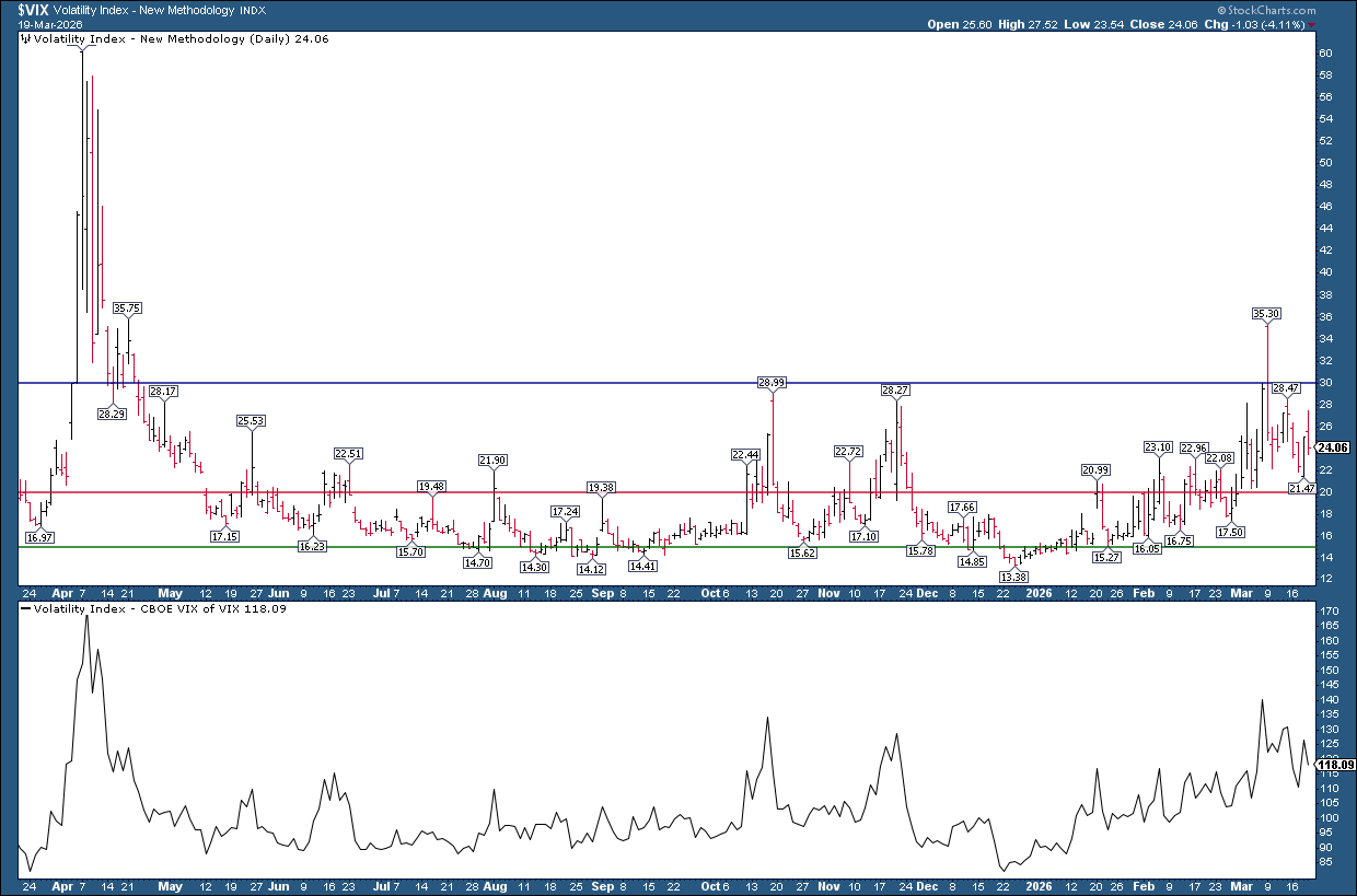
The VIX measures how scared investors are. Both VIX and its volatility are a bit high, yet they are far from extreme levels.
S&P 500 vs. 200‑Day SMA
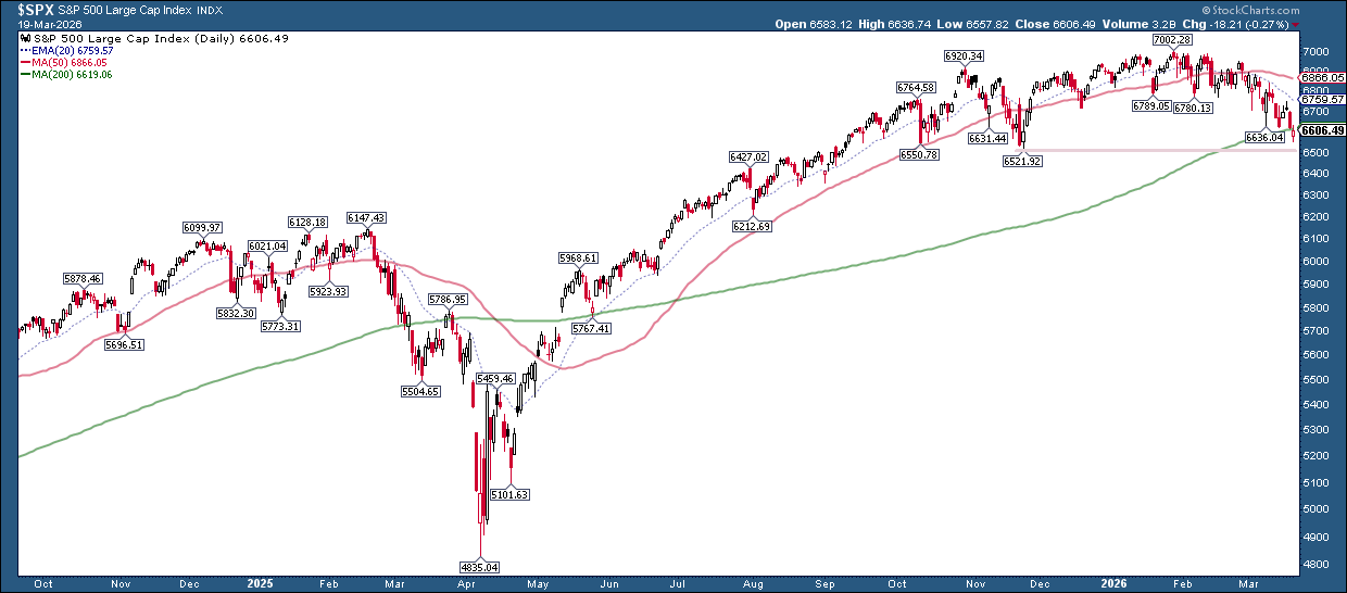
The S&P 500 is making lower lows. The big question is whether it can hold the 200‑day line or slip toward the next support near the November low.
Market Breadth
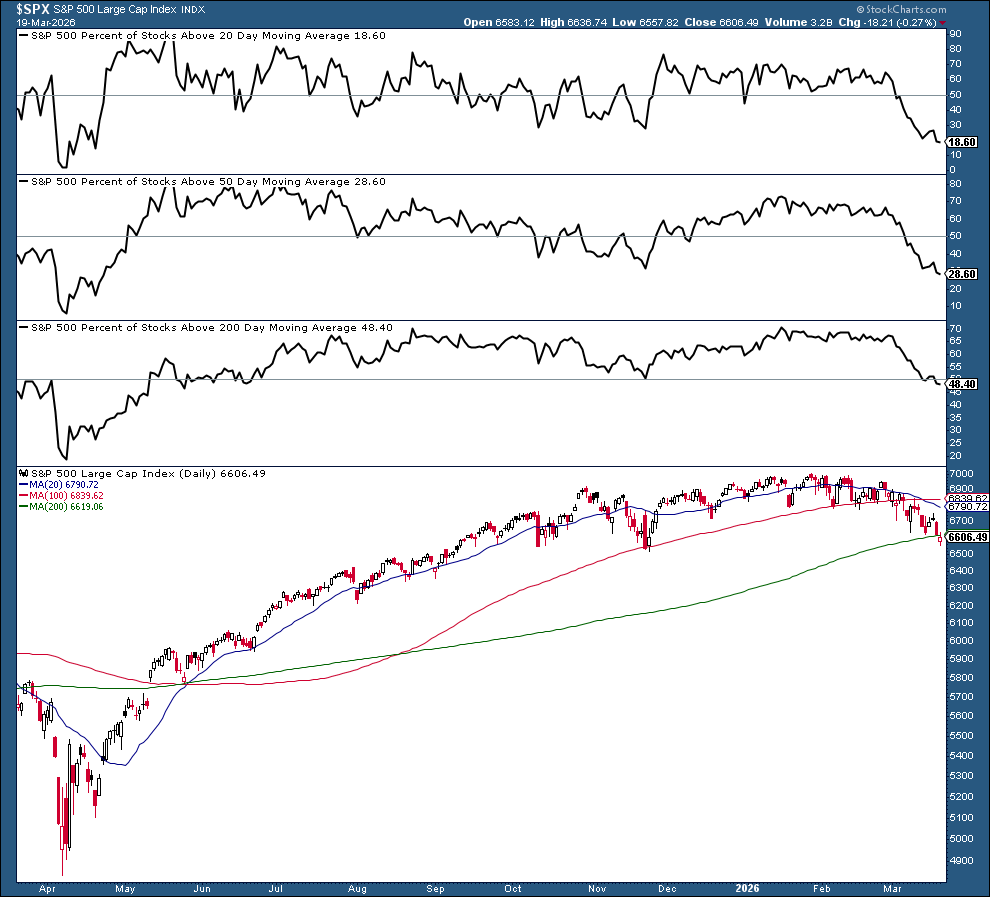
When fewer than 50 % of stocks stay above their 20‑, 50‑, and 200‑day averages, it signals weakening market participation.
Advancers vs. Decliners
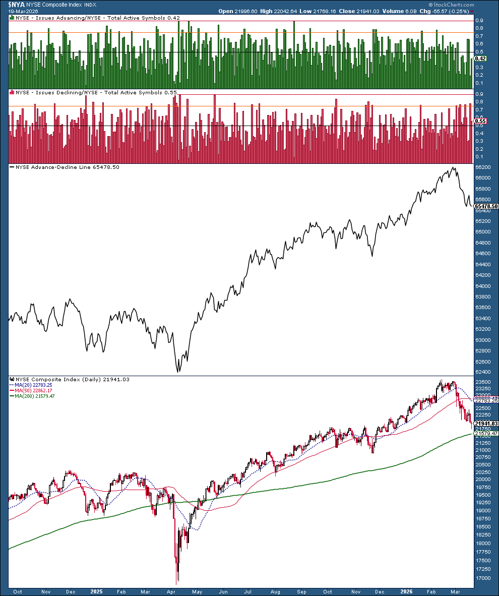
The decline in the advancer‑decliner line matches the weak breadth we saw earlier.
McClellan Summation Index
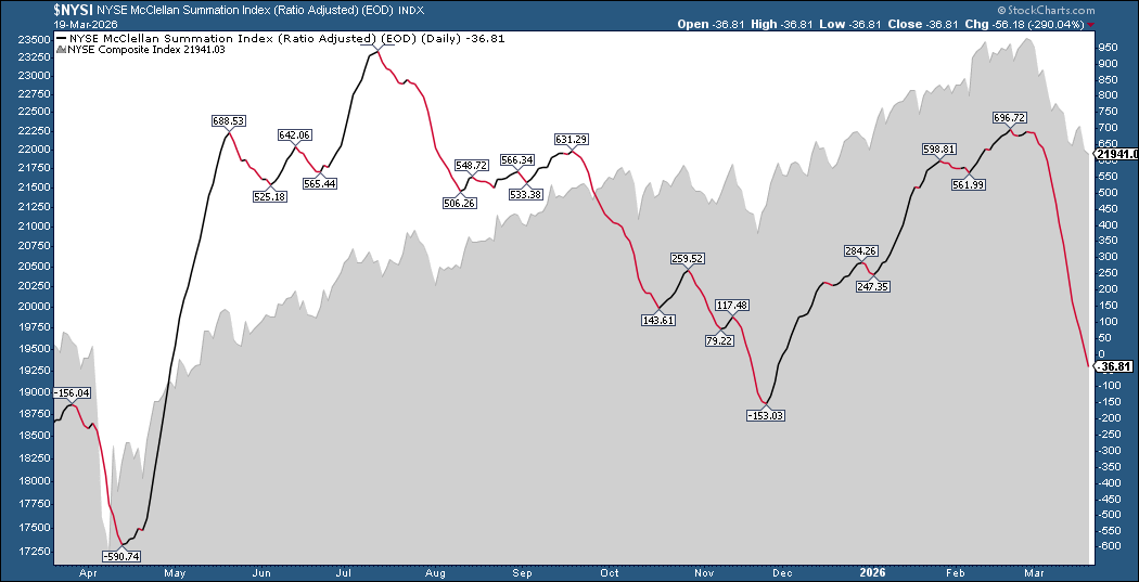
If the index falls below the November low of –153, it could point to more downside.
10‑Year Treasury Yield
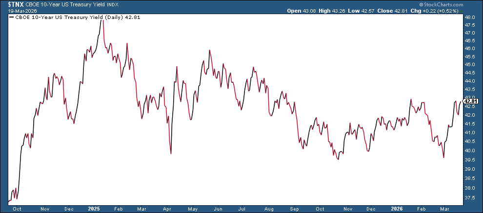
Higher yields often keep stock prices under pressure, especially when geopolitical risk and inflation remain concerns.
Putting It All Together
The market is not in a panic, but it is feeling the strain. Watch for these warning signs:
- VIX spikes upward.
- S&P 500 fails to stay above the 200‑day average.
- Market breadth continues to weaken.
- 10‑year yields stay high.
If several of these happen, the market could turn more sharply lower. If they stay calm, the index may keep grinding down slowly.
Having a pre‑market Chart List helps you stay focused and spot early signs of strength or weakness.
Try adding the charts above to a new list and customize it with any other charts you follow.
Disclaimer: This article is for educational purposes only and does not constitute financial advice. Always consider your own situation and consult a professional before acting.
Source: Materials provided by https://articles.stockcharts.com.Note: Content may be edited for style and length.