

Before we start…
Most traders only watch two RSI signals: overbought and oversold. When you do that, you miss the bigger picture.
What many don’t know is that the RSI’s range can show an up‑trend or down‑trend even without a price chart. By looking at how high and low the RSI moves, you can filter for strong stocks.
Let’s play a quick detective game.
Can You See the Trend Without a Price Chart?
Below is the RSI for a real stock over 18 months. No price data, just momentum. Can you tell what the trend looks like?
RSI Challenge 1
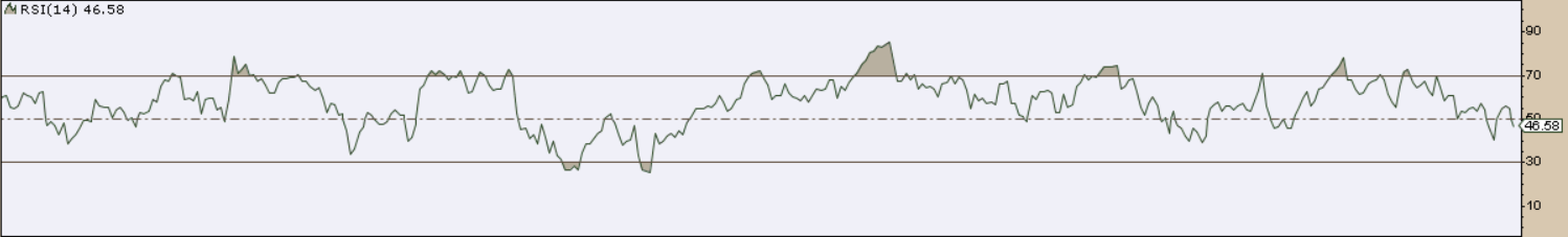
Questions:
- Was the stock mainly moving up or staying flat?
- Did a down‑trend appear? If so, when did it start?
- If a down‑trend started, did it turn back up? Where?
RSI Challenge 2
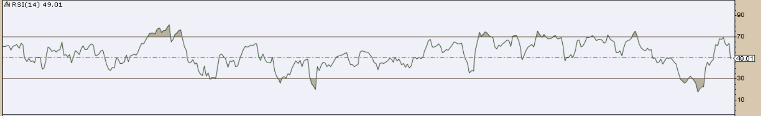
Questions:
- Was the stock flat, rising, falling, or a mix?
- If it mixed, how many up‑trends and down‑trends were there?
- Where did each trend begin and end?
Lesson: Focus on the RSI Range
Technical analyst Constance Brown taught that the RSI behaves differently in each trend.
- In an up‑trend, the RSI usually stays between 40‑50 at the low points and can climb above 80 during rallies.
- In a down‑trend, the RSI tends to linger between 55‑65 at the highs and may drop toward 20‑30.
So, instead of watching only the extreme overbought/oversold lines, look at the whole range the RSI travels. Strong stocks keep the RSI high; weak stocks can’t push it up or keep it low.
Answers to the Challenges
Challenge 1 – Goldman Sachs (GS)
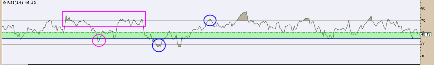
Just by looking at the RSI, most of the time it stayed in the bullish range. That tells us GS was mostly in an up‑trend.
A short dip below 40 showed a tiny weakness, but the RSI quickly jumped back above 70, showing buyers were still in control.
Later the RSI fell toward the 30 area, hinting at a brief down‑trend, but it rebounded above 70 again, and the up‑trend continued.
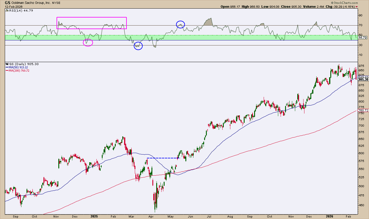
Notice how the RSI drop below 30 lined up with the price falling below the 200‑day moving average. When the RSI rose back above 70, the price broke above the recent high.
Challenge 2 – Apple (AAPL)
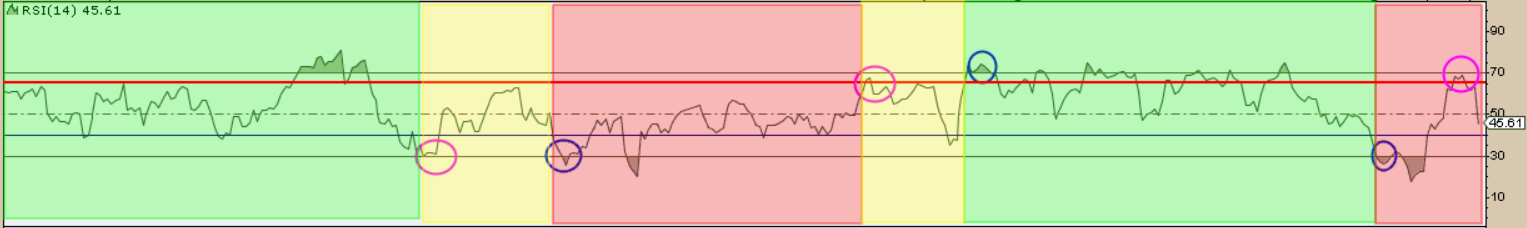
Green shading marks an up‑trend, yellow shows sideways movement, and red signals a down‑trend. The added 65 line helps see where rallies stop during a bear market.
The RSI stayed in an up‑trend until it slipped below 40, which put the trend in doubt. A drop under 30 confirmed a down‑trend.
When the RSI climbed back above 65, it hinted at a possible reversal, and the RSI moved back into a bullish range for a while. Another dip below 30 suggested another down‑trend, but the later rise above 65 again raised questions about the direction.
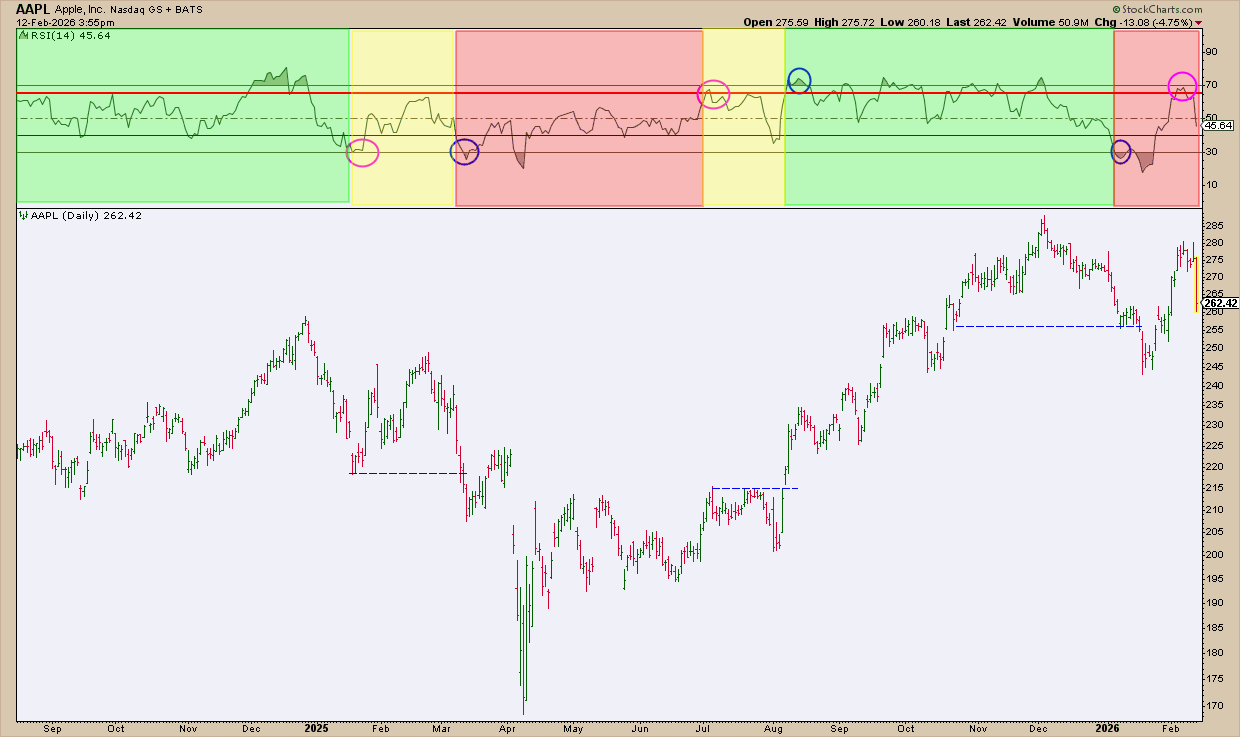
The RSI points line up with key breakout levels on the price chart, showing how useful the RSI range can be.
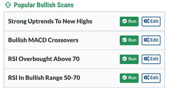
The RSI Bullish Range 50‑70 Scan
There is a ready‑made scan called “RSI In Bullish Range 50‑70.” I added two extra filters:
- Only S&P 100 stocks
- Technical Rank (SCTR) higher than 60
This looks for large‑cap S&P stocks that have strong technical scores and are currently trading with an RSI between 50 and 70.
Running the scan returns a short list of candidates. Review each chart using the RSI range rules before you look at the price. You’ll often see the strongest trends pop out instantly.
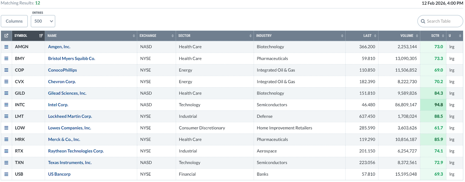
Try the scan yourself and make it a regular habit. It helps you find momentum leaders before most traders notice them.
Wrap‑Up
The RSI is more than just overbought and oversold signals. By reading the whole range, you can spot trends much easier. Add a simple RSI range scan to your routine, and strong moves will start finding you.
Source: Materials provided by https://articles.stockcharts.com.Note: Content may be edited for style and length.