

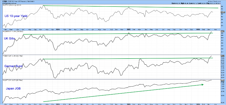
After a long period of calm, interest rates all over the world are starting to move up. This is happening not just in the United States but also in Europe and Asia.
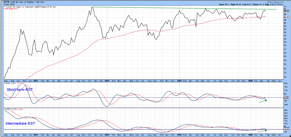
Recent data show that the 10‑year yields for the United States, the United Kingdom and Germany have been stuck in a narrow range. Japan is the outlier – its government bond yield has been climbing steadily, and the UK and German yields are now showing similar upward moves. The U.S. 10‑year yield is lagging a bit, but its chart suggests it may join the others soon.
Below we will look at short‑term rates first, then move to longer‑dated bonds.
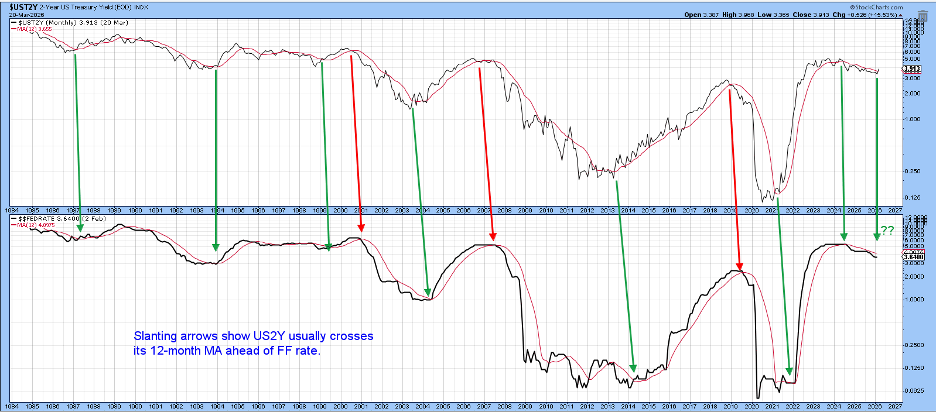
The 2‑Year Yield vs. the Fed Funds Rate
The Federal Reserve can set short‑term rates easily, but its influence fades as the bond term gets longer. Since mid‑2024 the Fed Funds rate has dropped about 100 basis points, while the 30‑year yield has risen a little.
When we compare the market‑driven 2‑year Treasury yield to the policy‑driven Fed Funds rate, the 2‑year line usually crosses its 12‑month moving average before the Fed Funds line does. This lead time changes with each market cycle.
That pattern helped explain the inflation spike in 2021‑22: the 2‑year yield jumped before the Fed responded, which added pressure to prices.
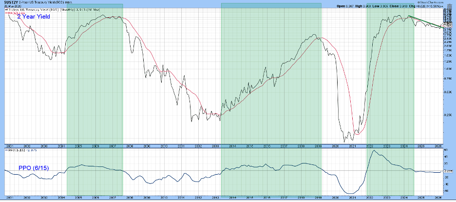
Right now the 2‑year yield has moved above its 12‑month average. The chart uses month‑end data, so the latest point isn’t official yet, but it hints that rates could keep rising.
Another technical tool, the Percentage Price Oscillator (PPO), shows green shading when it is above zero. Those green periods have matched most of the big yield climbs. At present the PPO is below zero, indicating a negative zone, but only a small rise would push it back into positive territory.
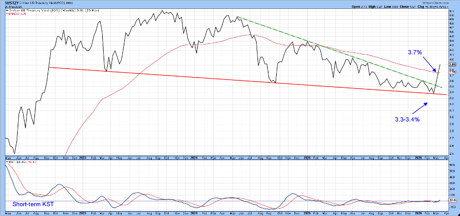
Even with the PPO still negative, the 2‑year yield has broken its weekly down‑trend line and also crossed its own down‑trend line. Breaking a line that has held for many weeks is a strong bullish sign, especially as short‑term momentum is turning upward.
Looking at longer‑dated bonds, the 30‑year yield has been riding a steady upward trend since late 2021. The chart highlights a three‑year down‑trend line that now acts as resistance. If the yield can close above this line, it would add another layer of confirmation to the overall rise.
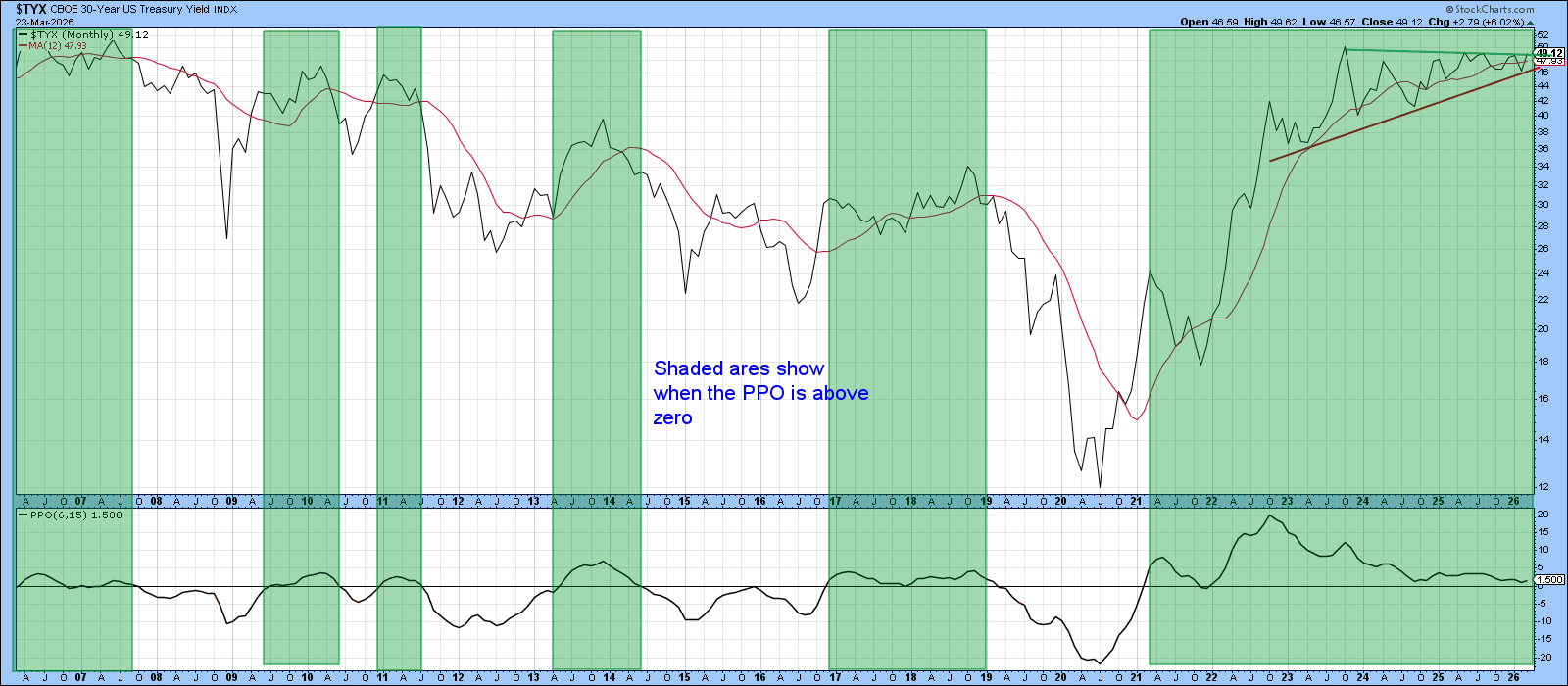
Current momentum indicators for the 30‑year yield are still positive and not yet over‑extended. This suggests the bond has enough technical support to push through the resistance and keep moving higher.
Stay curious and keep watching the charts.
Source: Materials provided by https://articles.stockcharts.com.Note: Content may be edited for style and length.