
Before we start…
It is easy to focus only on what is happening right now. News, headlines, and daily price moves can distract you. What you really need is context – a picture of how the market has behaved over many years. That big picture can give you an edge.
Technical analysis depends on history. The older the data, the more reliable the patterns. Below we look at four groups of historical charts, some dating back to 1900. I will show where they live, what they contain, and share a few insider tips to help you begin.
125 Years of Market Intelligence at Your Fingertips
The Historical Chart Gallery is a collection of long‑term charts. Some charts go back to the year 1900, depending on the index. The gallery is split into four sections and is refreshed each week.

Full access is for PRO members. Other users can see data back to 1980, which is still useful.
Key Market Indexes – A Large Scale Panorama
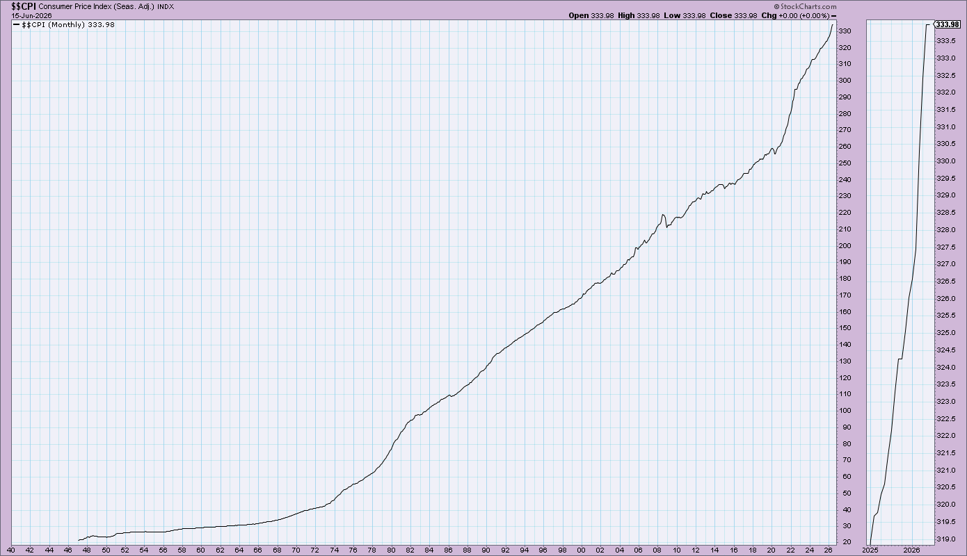
This section shows historic data for the three Dow indexes, the S&P 500, Nasdaq, and NYSE Composite. It also includes bonds (30‑year, 10‑year, 3‑month, Prime Rate) and commodities like gold, silver, oil, plus five major currencies. Economic indicators such as CPI, PPI, unemployment, housing starts, and GDP are also displayed.
Think of this as the cockpit of a plane – it helps you get oriented before you zoom in on a single chart.
Market Fundamentals – Your Valuation Compass
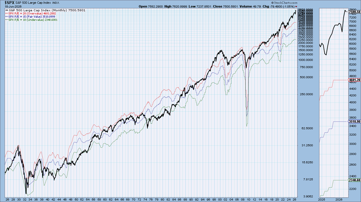
Two powerful charts live here. One shows S&P 500 earnings, price‑to‑earnings (P/E) and dividend yield over time. The other highlights periods when the market was over‑valued, fairly valued, or under‑valued.
These charts help answer a key question: Is now a good time to be in the market?
Market Breadth Indicators – The Undercurrent of the Market
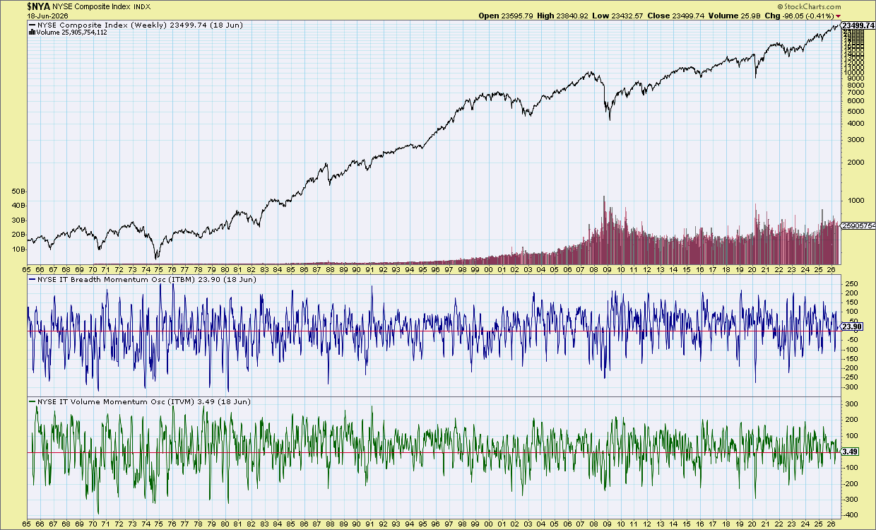
Price tells you what is happening on the surface. Breadth tells you what is happening underneath. If the index rises while breadth falls, the rally may be weak. If the market is flat or falling but breadth rises, it could mean hidden buying.
Most investors only watch price. This section shows what is moving the price, giving you clues about the market’s next move.
Presidential Cycles – Each Year a Different Pattern
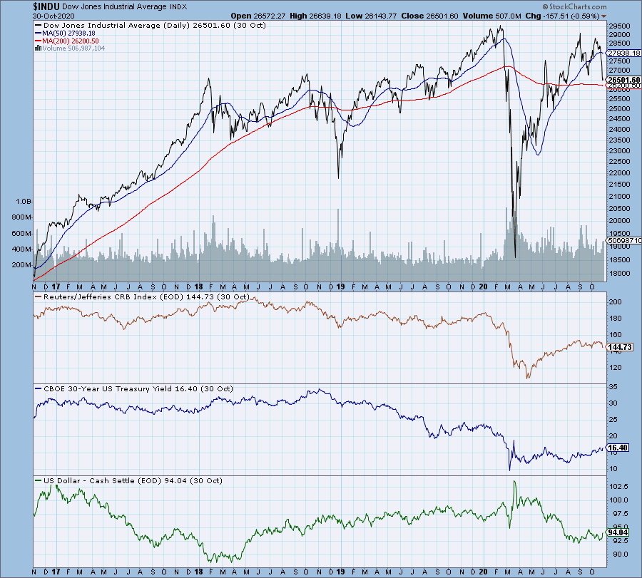
The Stock Trader’s Almanac tracks seasonal market patterns, including how markets behave in each year of a president’s term. While these patterns are not guarantees, they repeat often enough to be useful for planning.
This gallery section charts every presidential term since 1900. Yale Hirsch’s research on the strength of each year gives you a framework for timing decisions.
Insider Tips
Tip #1 – Valuation + Rate Double‑Check
Put the P/E range chart next to the 10‑year Treasury yield chart. High P/E in a low‑rate world is one thing. High P/E when rates are climbing is a warning. This combo has flagged every major overvaluation episode in recent history.
Tip #2 – Breadth Divergence Alert
If the S&P 500 makes new highs but the Advance‑Decline line flattens or falls, it signals a warning. The rally is being carried by only a few strong stocks.
Tip #3 – Presidential Cycle Overlay
Before you make a medium‑term market call, check which year of the presidential cycle you are in. Year 1 tends to be weak; year 3 is historically strong. Use the charts to see where the current cycle stands.
Wrap‑Up
The Historical Chart Gallery is not flashy. It does not send alerts or predict the next move. What it does give you is context and scale – a sense of proportion that many investors miss. When you can say, “I have seen this shape before,” you gain a hidden edge.
Source: Materials provided by https://articles.stockcharts.com.Note: Content may be edited for style and length.