

Most tools that watch Bitcoin’s main direction show a downtrend. Yet the price is now very close to an important support zone. If the price bounces, it could signal a pause or even a turn in the bear market. If the support fails, the outlook becomes more negative. Let’s first look at the longer picture to understand where we stand.
Chart 1 shows the 78‑week Rate‑of‑Change (ROC) indicator over the last ten years. The ROC had several strong negative gaps compared to price. It started with a massive 2,400 % rise in 18 months – the biggest ever recorded. By the fourth high, the ROC fell to about 80 %.
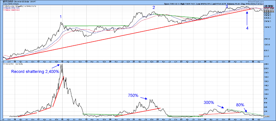
Negative gaps only matter when price confirms them. The confirmation came when Bitcoin broke a long‑term uptrend line drawn in red. That break can mean either a new downtrend or a long period of sideways trading. Either way, it is a big signal.
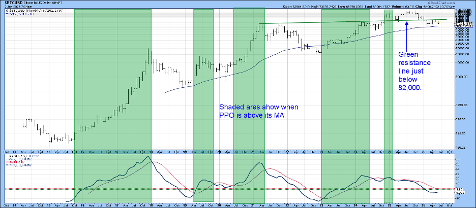
Chart 2 displays a clear bear market since spring 2024. The PPO indicator stays below its red moving average, and the price could not stay above the green resistance line. This “bull trap” shows that a rally lacked real strength and fell back quickly.
When a false breakout happens, traders often rush back in the opposite direction. Chart 3 shows that the breakout line now acts as a ceiling, stopping any upward move.
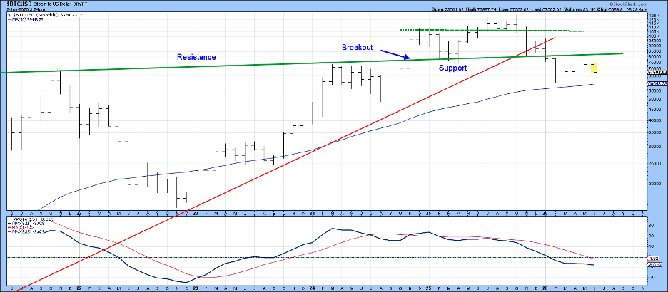
Chart 4 looks at price action since late 2025. Two key events appear:
- A false breakout between November 2025 and early 2026, confirmed by a break of the red support line.
- A whipsaw in May that pierced the upper red support line, followed by another break of the post‑February uptrend.
These false upward moves are typical signs of a primary bear market.
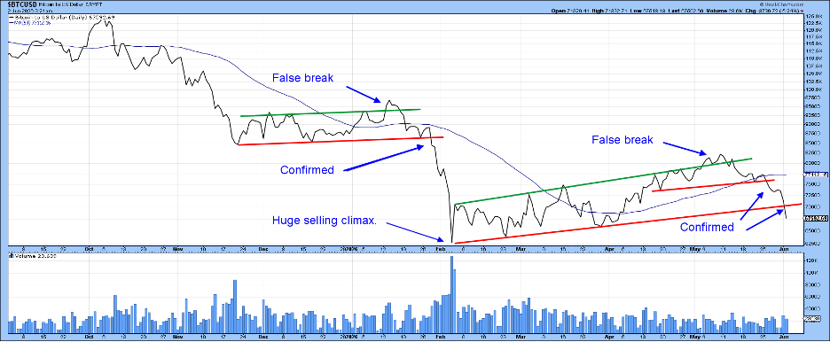
In February, a large amount of trading volume created a big selling climax. This could have major effects on the next move.
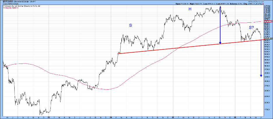
Chart 5 suggests that Bitcoin might be finishing a huge head‑and‑shoulders pattern. The pattern is not confirmed until price closes clearly below the $60,000 neckline. If that happens, the arrows point to a possible low around $30,000‑$32,000.
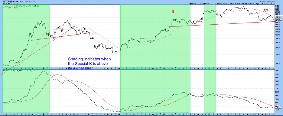
If the February low holds, or only slips a little, Bitcoin could take time to gather strength. A useful sign would be a break above the 200‑day moving average. That could let the SPK (Special K) line cross its signal line for the first time since October. While not a full proof of a bull market, it would be a positive first step.
Stay alert and watch the charts closely.
Source: Materials provided by https://articles.stockcharts.com.Note: Content may be edited for style and length.