
Before we start…
Sectors are like the heartbeat of the market. Money moves in and out, creating pressure that shows up as price changes. Some chances to profit are obvious, others hide in the noise. Watching sectors lets you see the market’s hidden moves before they become obvious.
There are many tools that look at sector breadth from different angles. Most traders pick one or two. The real edge comes from stacking several together.
The Core Stack: Free Tools for Sector Analysis
Each tool focuses on a specific part of sector movement. Use them together for a 360‑degree view of the market.
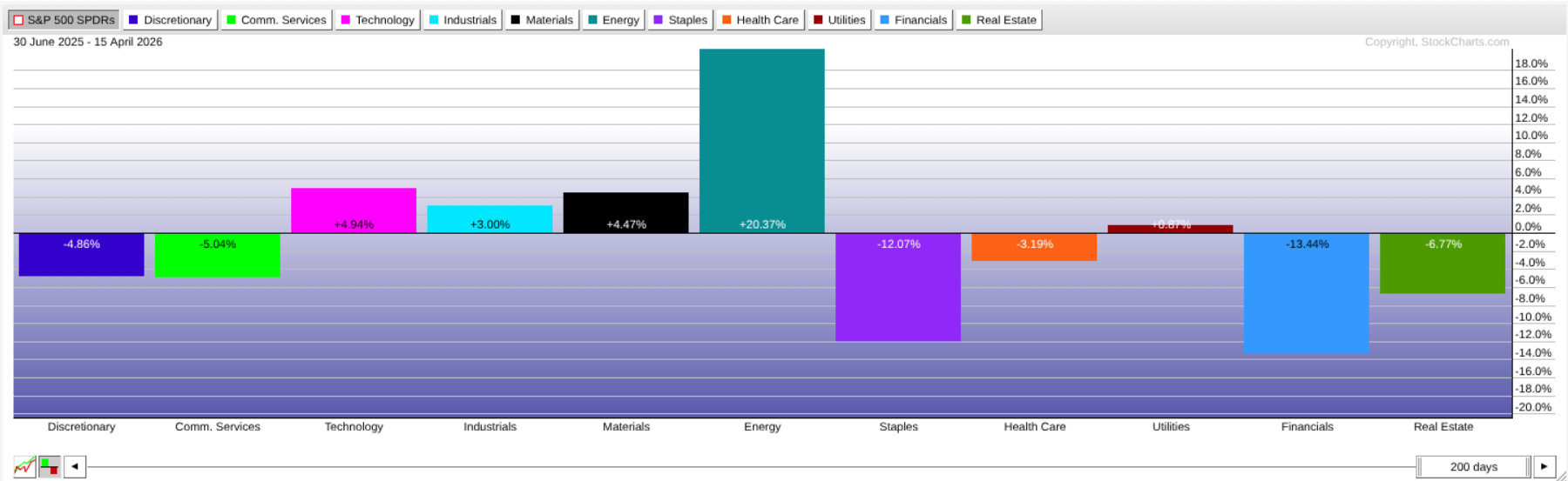
1 – Sector Drill‑Down
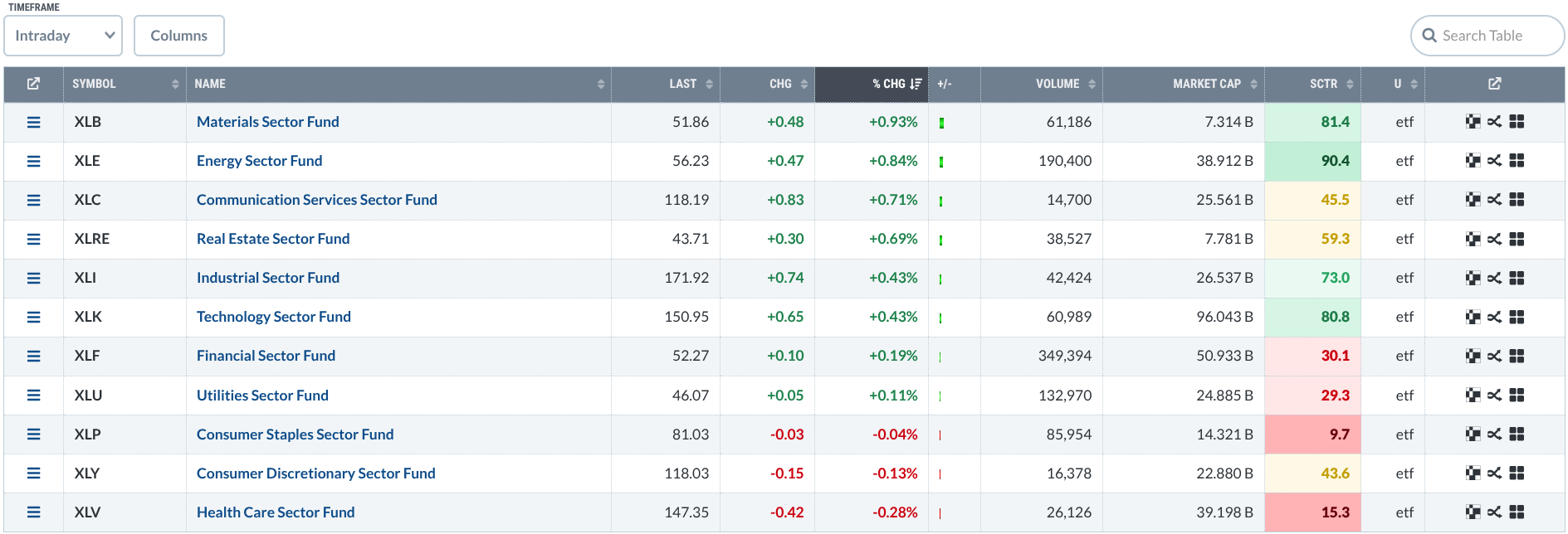
Start here. The Drill‑Down ranks all 11 S&P sectors by actual and relative performance (using StockCharts Technical Rank). Switch between intraday and one‑year views to see which sectors lead and which lag.
Click a sector to jump from the sector level to industry and then to individual stocks. The ranking lifts the strongest technical setups to the top.
2 – Market Summary US Sectors
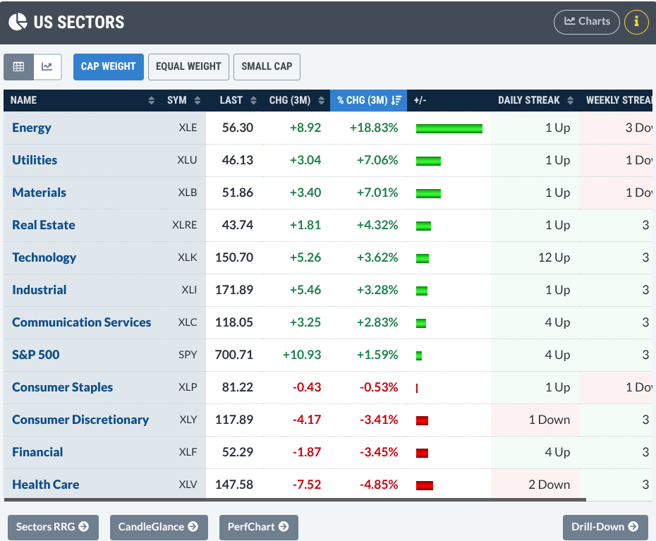
Found on the Market Summary page, this view also ranks sectors but adds extra options. You can compare different weightings, see Relative Rotation Graphs, or view PerfCharts and CandleGlance charts. It’s a versatile hub for sector data.
3 – Relative Rotation Graphs (RRG)
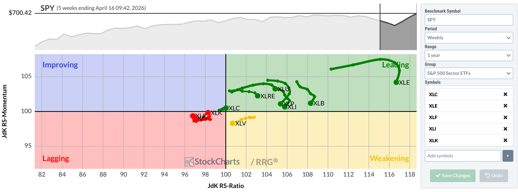
RRGs show how sectors move over time. They plot relative strength and momentum against the S&P 500, then add arrows that tell you if a sector is gaining, losing, or staying steady. This gives you a sense of the sector’s future direction, not just a snapshot.
4 – PerfCharts
PerfCharts condense performance into a single picture. You can compare each sector ETF side‑by‑side as lines or bars. The result is a quick, clear view of who’s beating whom.
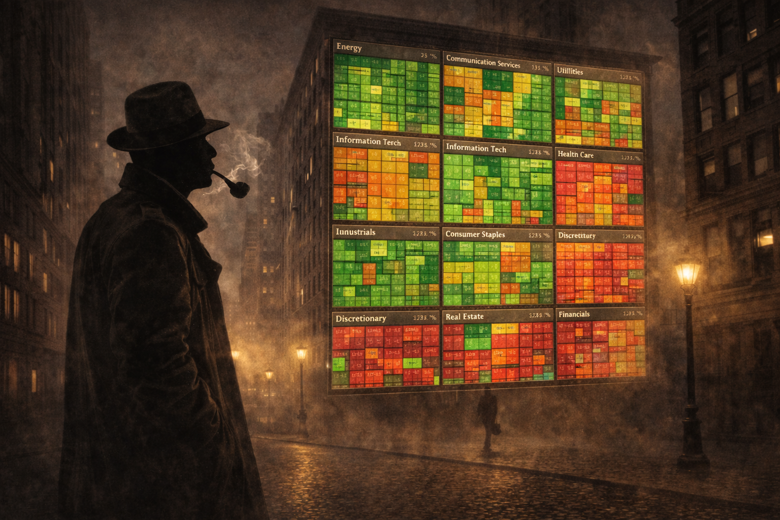
5 – MarketCarpets
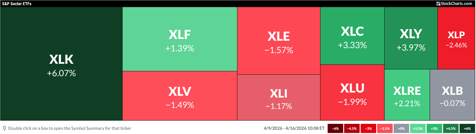
MarketCarpets are heat‑maps that color‑code sectors based on price, an indicator, or a time frame. Flip through the views to get a nuanced snapshot of sector activity in seconds.
6 – CandleGlance
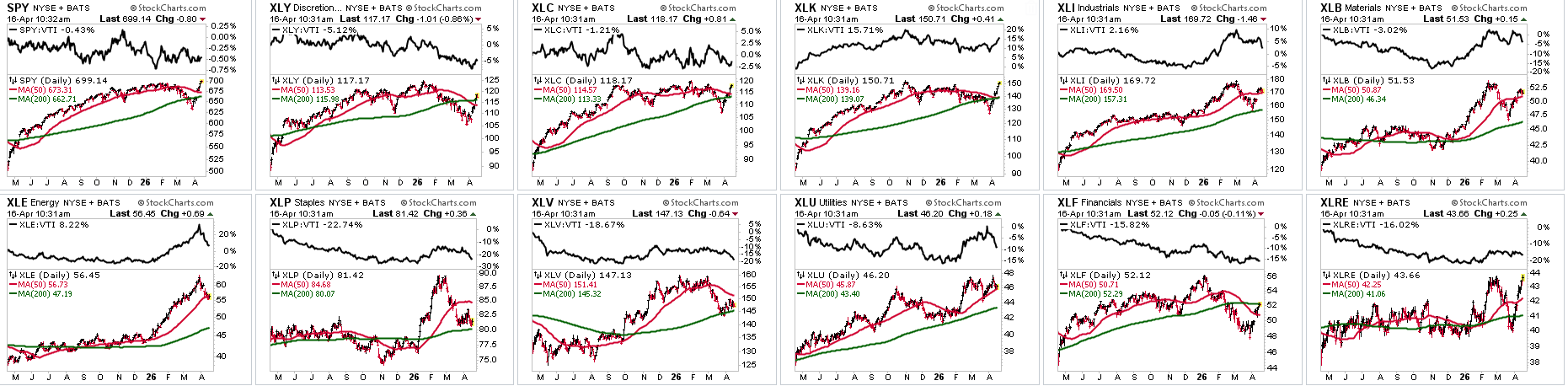
CandleGlance gives a fast scan of price, moving averages, and relative strength versus the Vanguard Total Stock Market ETF (VTI). It’s a quick way to confirm a trend or filter out noise before a deeper dive.
7 – Symbol Summary
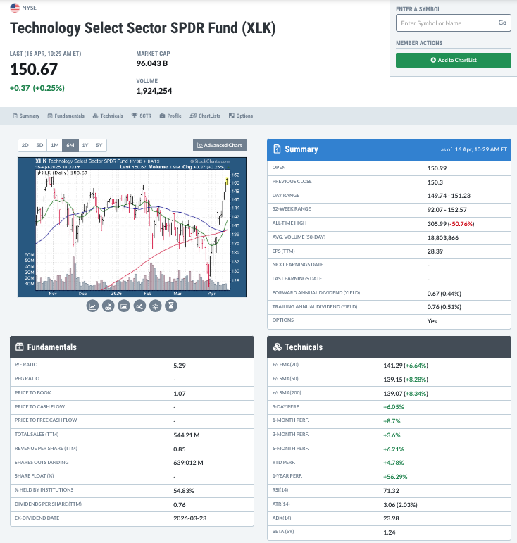
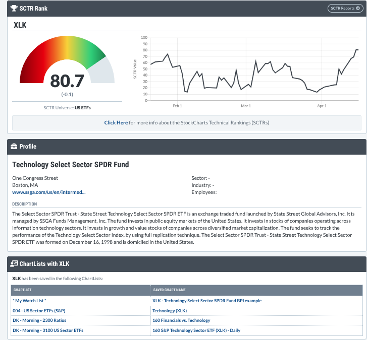
If you need deeper technicals or fundamentals, the Symbol Summary gathers everything—technical indicators, earnings, SCTR rankings, and more—into one screen. It’s the place to test your bias before you act.
8 – Ratio Charts
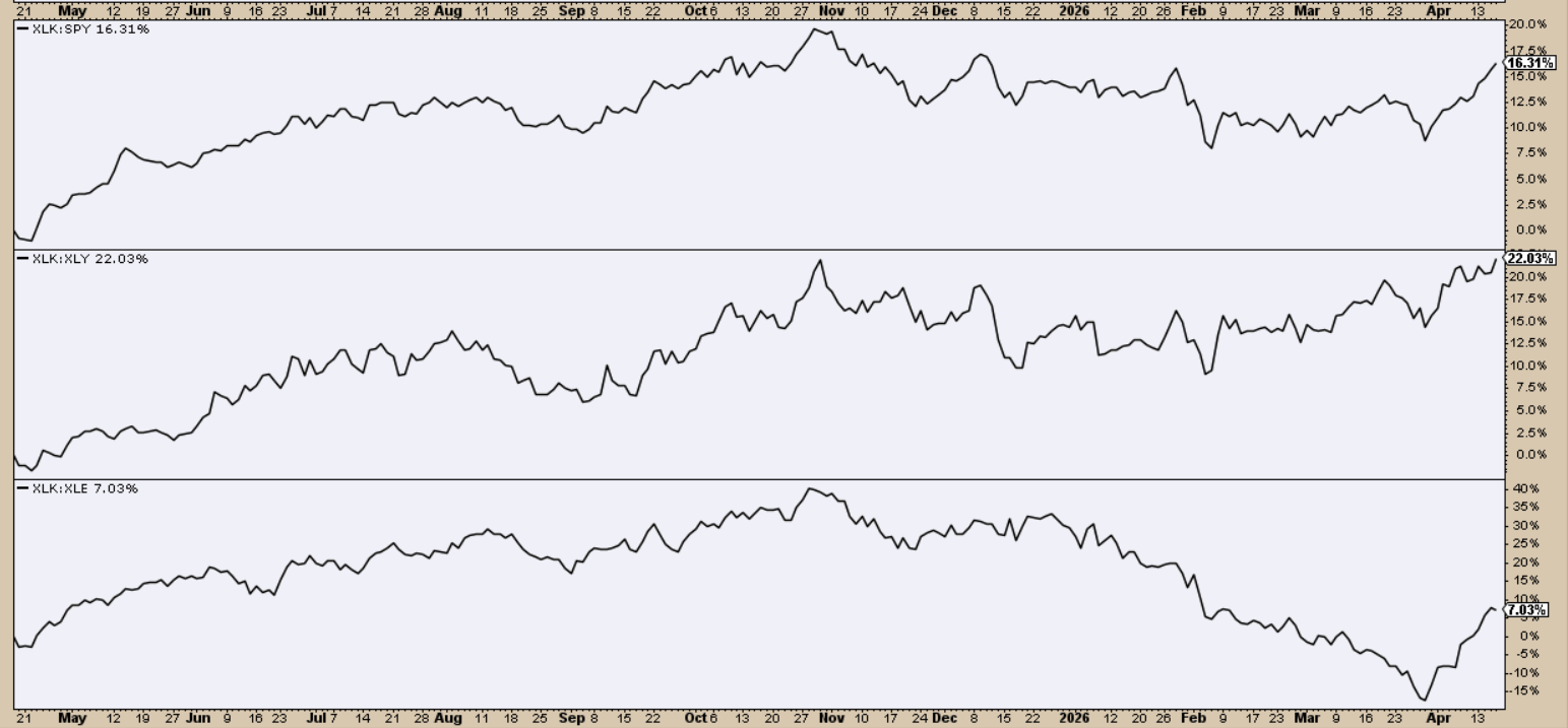
Ratio charts strip away everything except relative performance. They answer two questions: Is a sector beating a benchmark, and by how much? Compare a sector to another sector, the market, or a different asset class to see where the real strength lies.
9 – Sector Bullish Percent Index (BPI)
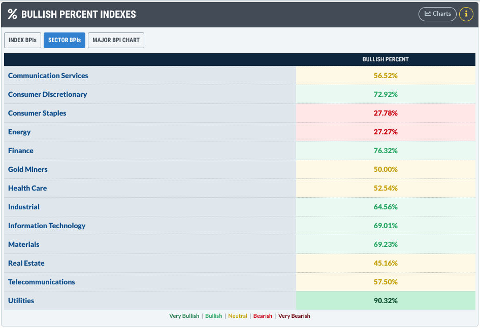
The BPI shows the percentage of Point‑and‑Figure buying signals inside a sector. A high BPI hints that many traders are buying, while a low BPI suggests selling pressure. It’s an early‑warning system for hidden market moves.
10 – Seasonality Charts
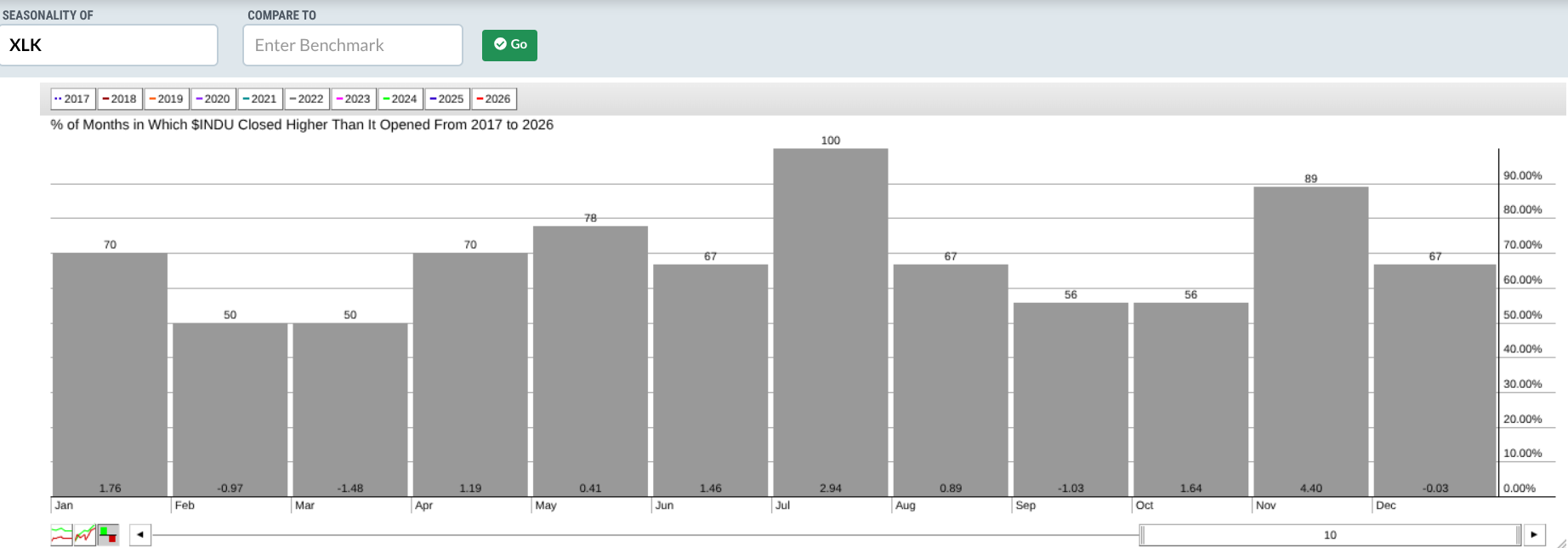
Seasonality looks at calendar patterns that have repeated over many years. It doesn’t predict the future, but it shows when a sector has historically risen or fallen in a given month. If the pattern is strong, you can plan trades around those windows.
Putting It All Together: Your Insider Sector Stack
Here’s a quick checklist of the ten tools and what they give you:
- Sector Drill‑Down – Spot the leading sectors.
- Market Summary (US Sectors) – Slice and dice sector data in many ways.
- Relative Rotation Graphs (RRG) – See where money is rotating.
- PerfCharts – Get a clean picture of performance.
- MarketCarpets – View sector heat‑maps instantly.
- CandleGlance – Confirm trends with a quick glance.
- Symbol Summary – Verify technical and fundamental data.
- Ratio Charts – Compare performance side‑by‑side.
- Sector Bullish Percent Index – Detect hidden buying or selling pressure.
- Seasonality Charts – Know when the big moves usually happen.
Wrap‑Up
When you use these tools together, you move from reacting to headlines to reading the market’s underlying structure. That deeper view gives you a clear edge and helps you make smarter, more confident trading decisions.
Source: Materials provided by https://articles.stockcharts.com.Note: Content may be edited for style and length.