

In late March I thought the market was ready to rise. Prices fell a bit at first, then stocks went up almost without stopping. The S&P 500 even reached a new record high, while the Dow and NYSE indexes are still below their peaks. The big question now is: can the rally keep going, or is it near the end?
Usually, a market that is stuck will eventually move in the direction of its main trend. All three major indexes are still above their 12‑month moving averages, and the breadth of stocks is healthy. Even with a lot of bad news, the market kept climbing. If negative news can’t push prices down, what could?
That said, the market looks stretched upward. Several long‑term signals are starting to turn, making further gains harder. I am watching three key signals that may show whether the rally can hold.
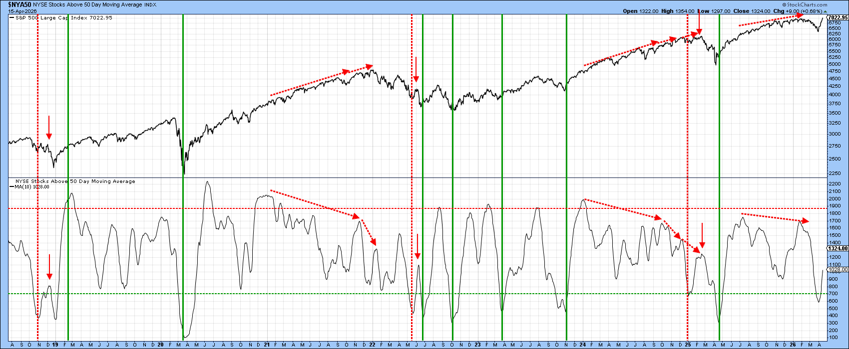
NYSE Bullish Percentage
The chart below shows the percent of NYSE stocks that are trading above their 50‑day moving average, smoothed over ten days. Right now it is climbing from a low level, which often means more upside is possible. However, past patterns have shown that after a bounce from a low, the market sometimes turns down quickly and makes new lows. I will keep an eye on this.
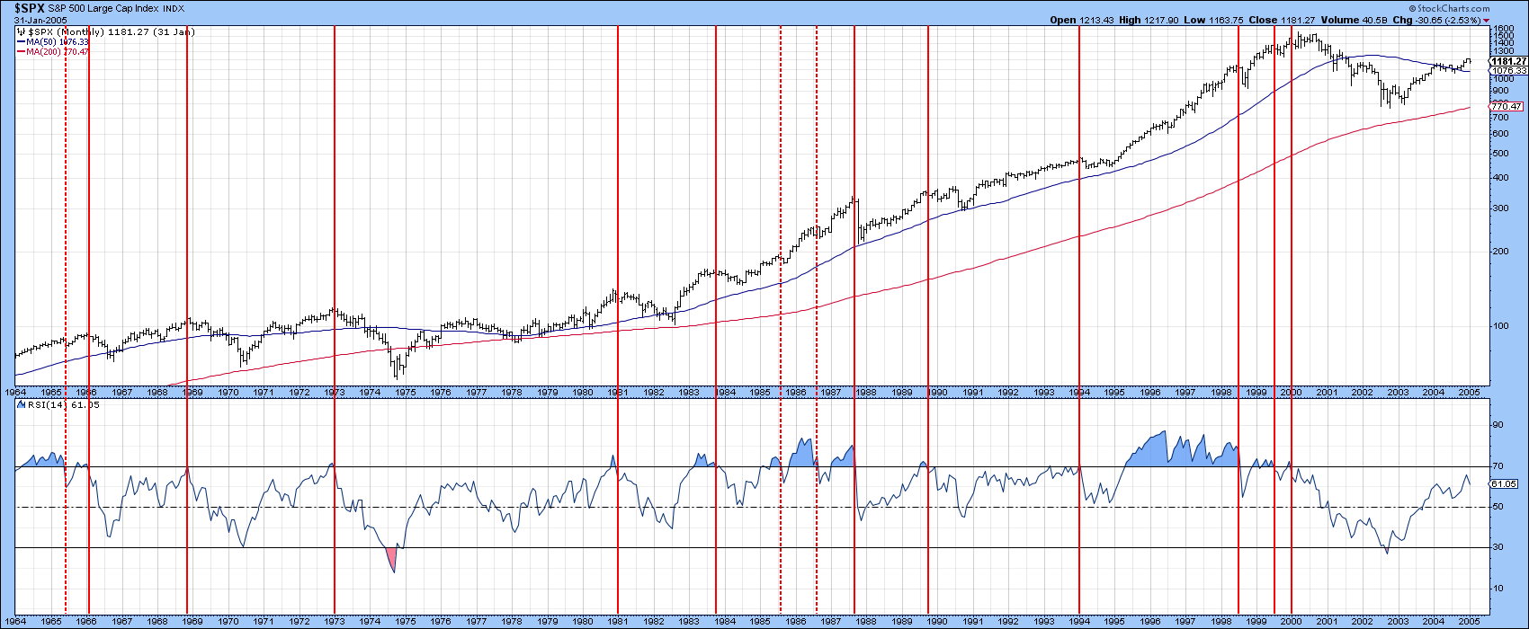
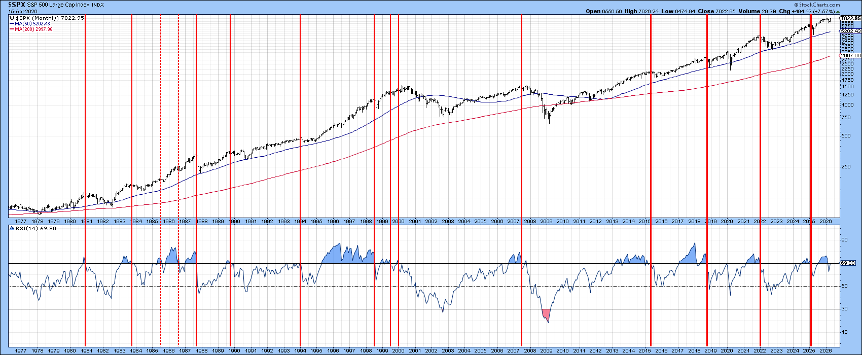
S&P Composite and 14‑Month RSI
The 14‑month Relative Strength Index (RSI) for the S&P 500 has been a reliable warning sign in the past. When the RSI falls below the overbought zone, it often points to a coming pull‑back. The chart below shows the RSI dropping below that zone and now trying to climb back up. If it stays above the overbought line, the market could stay strong for several months. If it falls again, we may need to be more cautious.
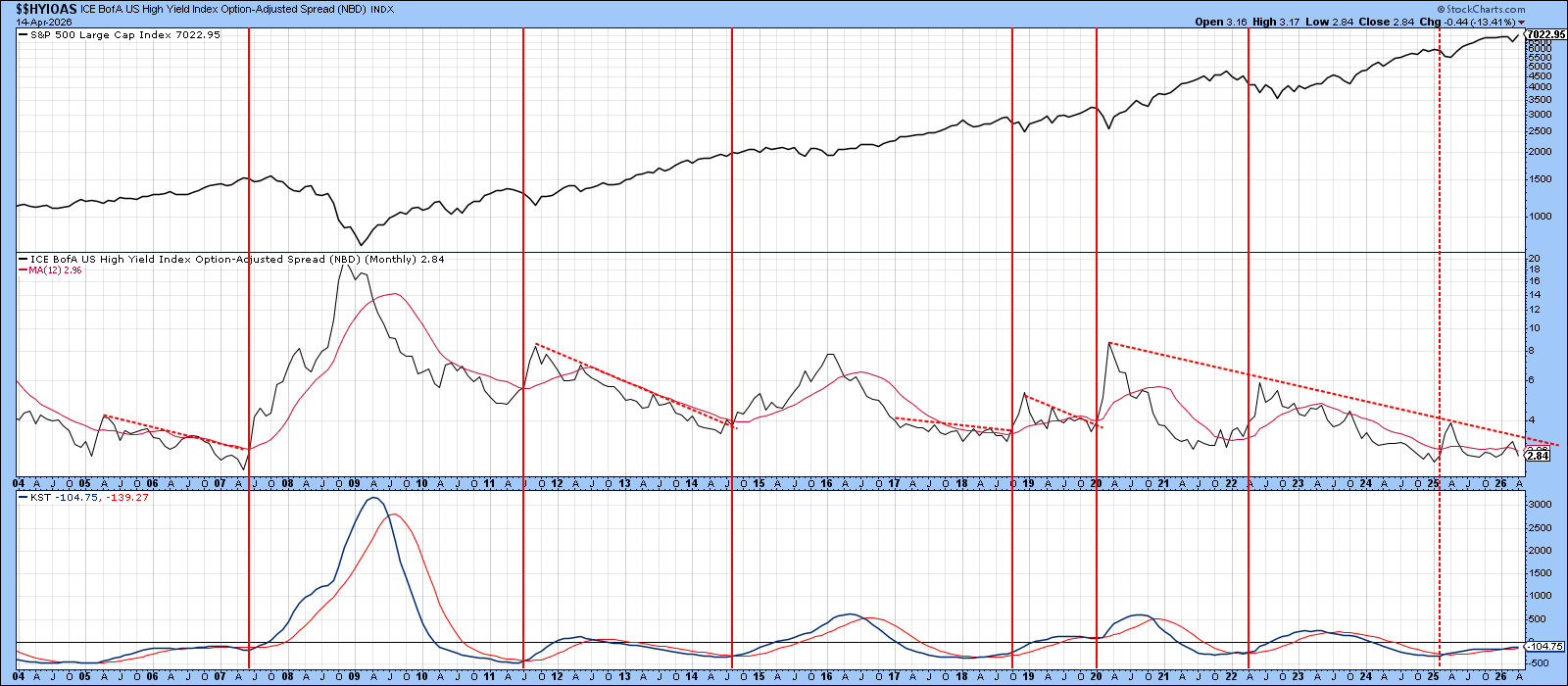
Key Credit Spread
The ICE BofA US High Yield Option‑Adjusted Spread (OAS) measures how much extra investors demand for holding risky corporate bonds. A higher spread means investors are nervous, which can hurt stocks. A lower spread shows confidence and can help stocks rise.
Historically, when this spread breaks a long‑term down trend line, the equity market often falls soon after. Right now the spread is low, but a small shift in credit market sentiment could push it higher and warn that risk appetite is fading.
Stay safe and happy charting!
Source: Materials provided by https://articles.stockcharts.com.Note: Content may be edited for style and length.