

The market fell after oil prices jumped and worries rose in the Middle East. The drop was smaller than many expected. Investors could have taken profits from strong 2025 gains, but the slide stayed limited. Some short‑term signals now show very low levels that often come before a 2‑to‑6‑week rise.
Chart 1 shows the major indexes moving around their 200‑day moving averages. The Russell 2000 and NYSE Composite have already bounced back above that line. The S&P, Dow, and Nasdaq are trying not to break lower. The last time all these indexes fell below the 200‑day line, in March 2025, a faster decline began.

Two Sensitive Indicators Have Turned
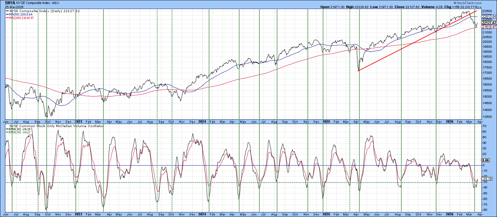
Chart 2 displays the McClellan Volume Oscillator for the NYSE. A smooth 10‑day line helps see the pattern. In the past, when the oscillator entered the green oversold zone and then rose, rallies of at least two weeks usually followed. Dotted lines point out the few false signals.
The oscillator spent about a week below the oversold line. It is now edging above its 20‑day average, suggesting a possible start of a new rally phase.
Advance‑Decline Volume Supports the S&P
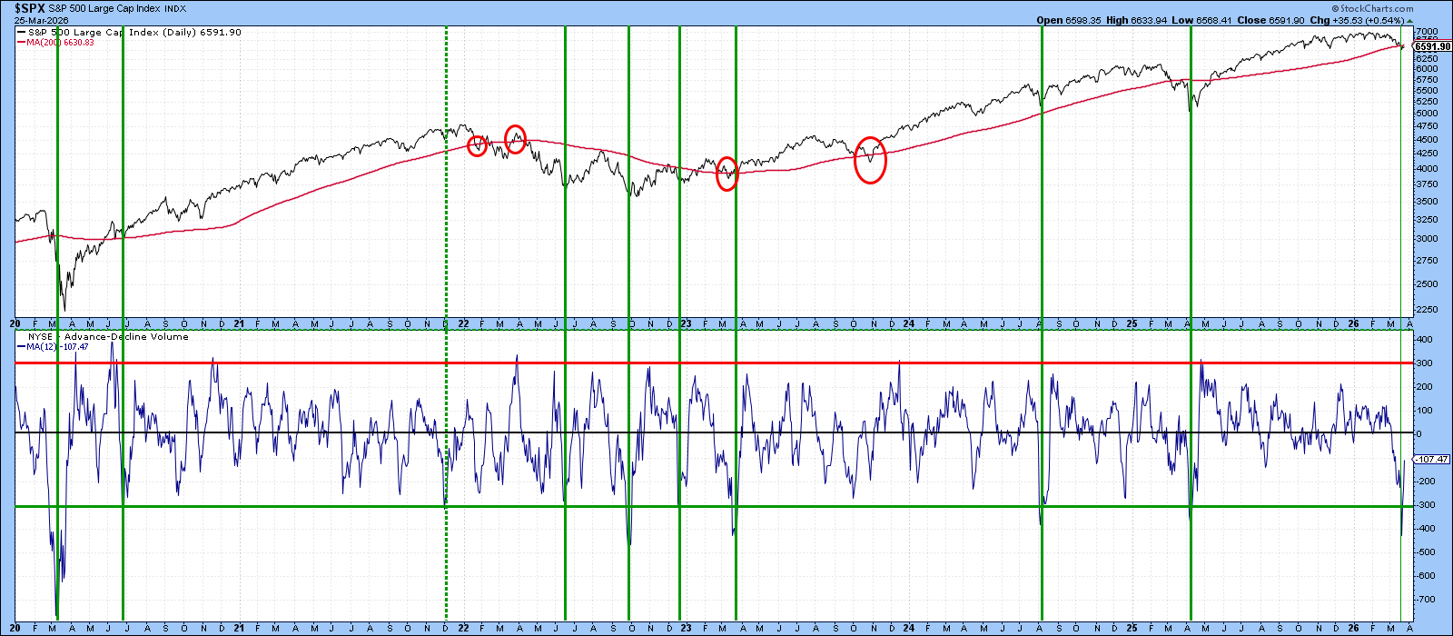
Chart 3 compares the S&P 500 with a 12‑day moving average of advance‑decline volume, looking back to 2020. The 200‑day average remains a key level for the S&P (SPY). Occasionally the line is crossed falsely, but most crossings matter.
SPY is trying to stay above that benchmark. The A/D volume line fell sharply below its green oversold level and has since rebounded. Past oversold reversals since 2020—except one in late 2021—were followed by solid rallies.
NYSE Stocks Above Their 50‑Day Average
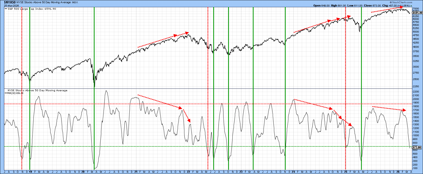
One favorite measure is the percent of NYSE stocks trading above their 50‑day average. The chart uses a 10‑day smooth line, so it moves more slowly than the oscillators above. Right now it stays below the oversold threshold and is drifting lower, so it has not yet given a buy signal.
If the oscillators in Charts 2 and 3 prove correct, this percentage should eventually rise as well. The big peaks in 2022 and 2025 were preceded by negative divergences (red arrows). The most recent peak shows a simpler pattern, hinting that the current correction linked to the Iran conflict may be less severe and that a new market high could appear.
What Is the VIX Saying?
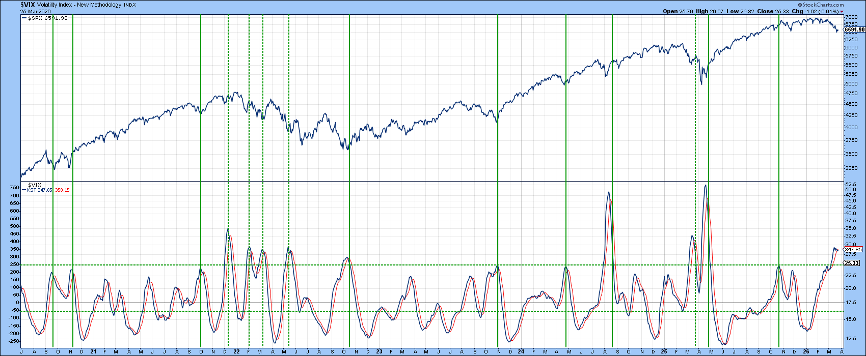
Chart 5 shows the daily KST of the VIX. The indicator signals a buy when fear pushes the line above a stretched dashed level and then turns down. This works well in a bull market, but the dashed lines in 2022 remind us that false signals appear in a bear market.
At present the KST looks like it is topping, but it has not turned down decisively yet. It remains a work in progress.
Bottom Line
Several short‑term indicators are flashing buy signals while the major indexes struggle to stay above their 200‑day averages. A few other oscillators are close to their buying zones and may align in the next few days. If these signals appear but the market does not rally, it could be a sign of a deeper bear phase.
Source: Materials provided by https://articles.stockcharts.com.Note: Content may be edited for style and length.