

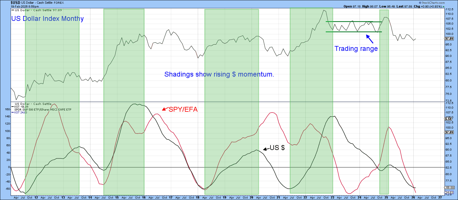
Earlier this year I noted that the Europe‑Australia‑Far East ETF was beginning to outpace the S&P 500. Since then the spread has widened, yet the flood of commentary echoing that narrative feels a bit premature.
One recurring theme in the SPY/EFA ratio is its tendency to mirror the long‑term moves of the U.S. Dollar Index. Over the past fifteen years the two have bottomed together on four occasions, each time followed by a stronger dollar and a period of U.S. equity outperformance. The most recent low in 2023 broke the pattern, but the broader alignment remains intact.
Right now both the ratio and the Dollar Index sit in clear downtrends and look oversold. All of the classic signs for a bounce are lining up.
Before diving into the technicals, it’s worth stressing that market sentiment toward the greenback is deeply bearish. From a contrarian angle that’s encouraging—most of the negative narrative appears to be priced in already.
“Investors Turn Record Bearish on the Dollar – Is This the Final Flush?”
AOL, Feb 18 2026
Bank of America’s Global Fund Manager Survey shows the current bearishness is the strongest in at least fourteen years.
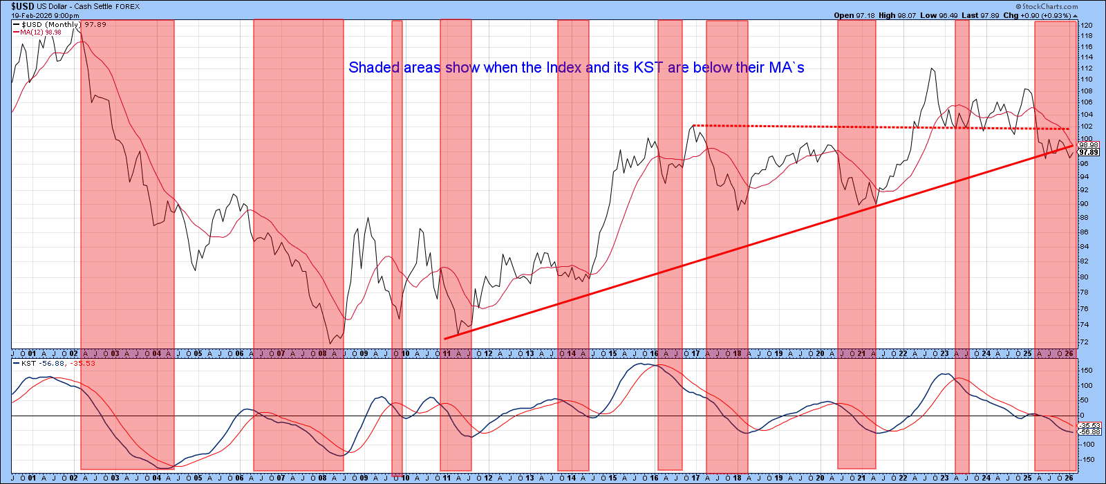
The chart highlights two tell‑tale conditions of a primary bear market: the index and its long‑term momentum both sit below their moving averages. By that metric the dollar is in a major downtrend, but the break has been more sideways than catastrophic, suggesting the technical picture may not be as fragile as it appears.
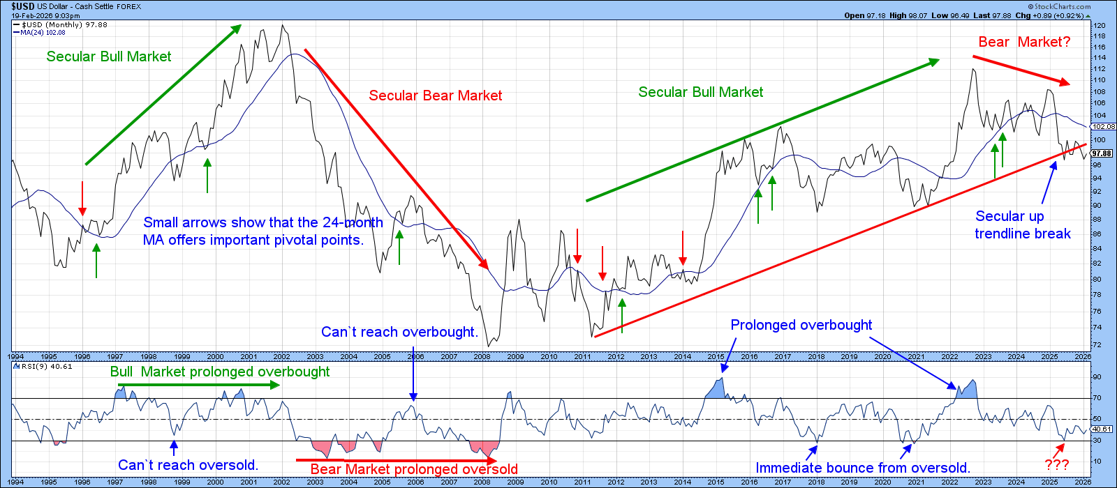
Historically, bull phases generate persistently overbought RSI readings and rebound quickly whenever the RSI slips into oversold territory. Mid‑2025 lacked the red‑shaded bearish periods seen in the 2003‑2008 bear market, hinting at a more range‑bound, possibly bullish, environment.
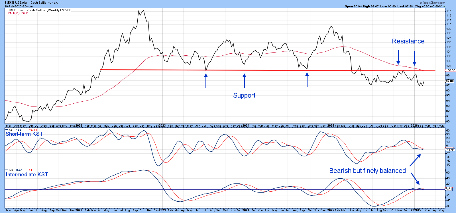
On the three‑year chart the long‑term trendline that once acted as support now doubles as a key resistance level. The index failed to break below its mid‑2025 trough, which means the bearish breakout could end up being a false signal.
If the index can rally above its 65‑week EMA—currently intersecting the extended trendline near the 100 mark—both KST readings could flip to the upside with only a modest bounce.
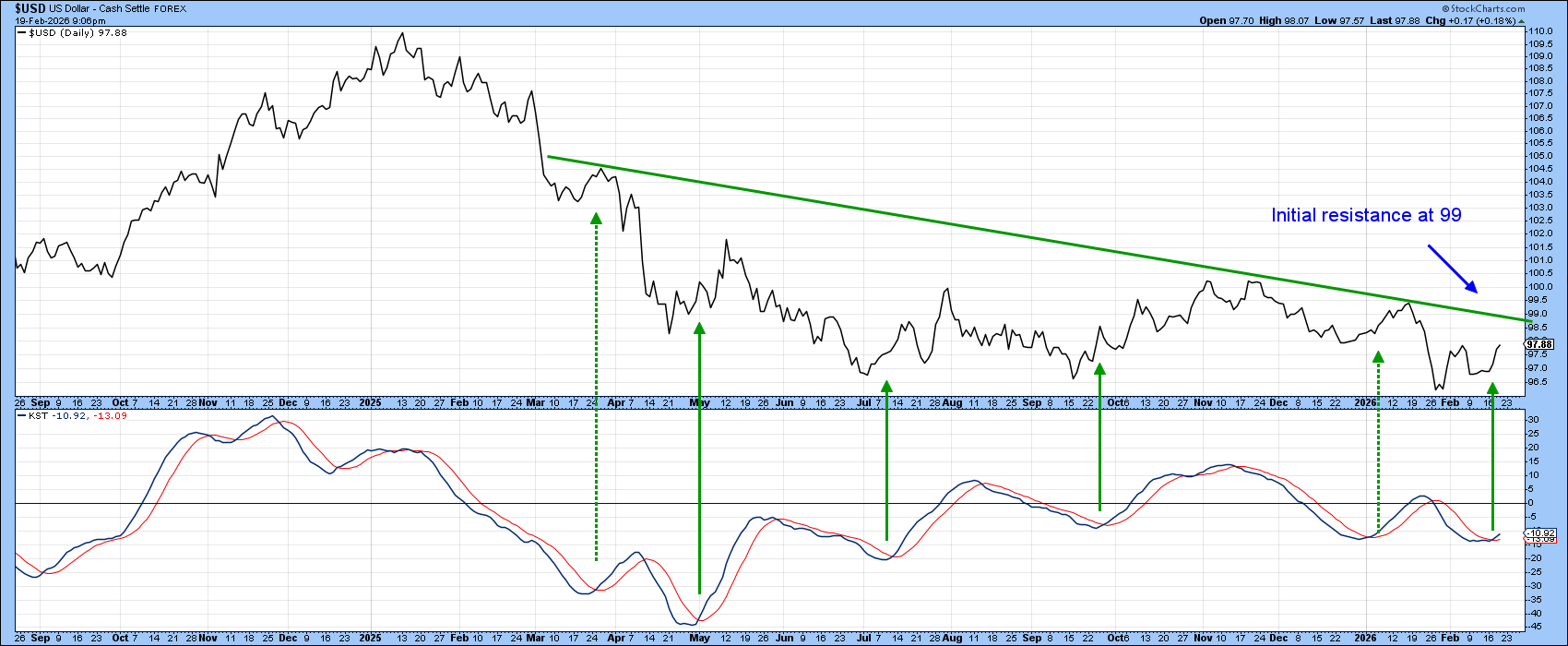
The daily KST has already turned higher, offering the first glimpse that the crowd of dollar bears might have mis‑read the market. Should the index break above the green down‑trendline, it would signal a decisive shift in sentiment.
Stay vigilant, watch the key levels, and let the charts guide your next move.
Source: Materials provided by https://articles.stockcharts.com.Note: Content may be edited for style and length.