
First things first…
Buying a house isn’t just about price tags and glossy photos. You look at the street, the yard, even the foundation. Yet many traders look at a stock the same way—only one chart and a couple of numbers. That gives a very narrow view.
ChartLists change that. Inside each list is a hidden menu that lets you see the same group of stocks from many angles, fast. The result? A broader picture that most traders miss. The more angles you see, the clearer the market becomes.
Why a ChartList Is More Than a Simple List
Most people treat a ChartList like a plain watchlist. Over time it has grown into an analysis hub. The built‑in menu opens up several ways to look at the data, not just one.
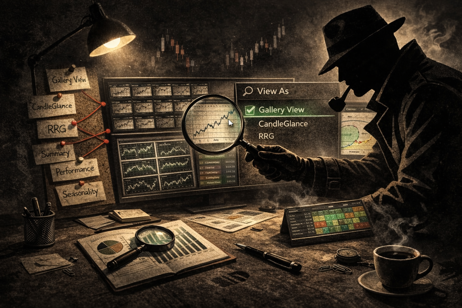
Imagine you are tracking the "Magnificent Seven" stocks. They already appear in your ChartList. Click the View As button and a new panel appears.
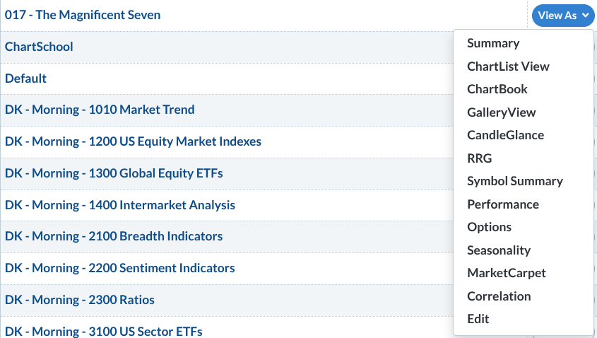
The panel shows the list on the left and the View As options on the right. They’re easy to miss but very powerful.
Seeing the Market All At Once
Tip #1: Use Gallery View to see the big picture while fine‑tuning details.
Gallery View shows each stock on intraday, daily, weekly, and point‑and‑figure charts. It helps you pick entry points, avoid trades against the trend, spot breakout levels, and separate real moves from market noise.
Tip #2: CandleGlance lets you spot leaders in seconds.
Instead of opening each chart one by one, CandleGlance gives you a grid of tiny charts that often include the 50‑day and 200‑day moving averages. This quick glance tells you which stocks are trending up or down.
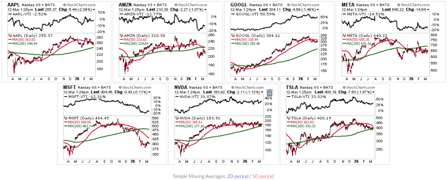
The tool also lets you compare each stock to a broad market benchmark, such as the Vanguard Total Stock Market ETF. This shows whether a stock is simply moving or actually beating the market.
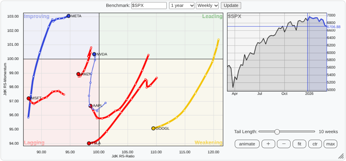
Tip #3: Watch leadership shifts with Relative Rotation Graphs.
Relative Rotation Graphs (RRG) plot where market leaders are heading relative to the S&P 500. The chart splits into four zones: Leading, Weakening, Lagging, and Improving. It’s a fast way to see who’s gaining strength and who’s losing it.
Looking at the Numbers Behind the Charts
Tip #4: Step away from the picture and check the data table.
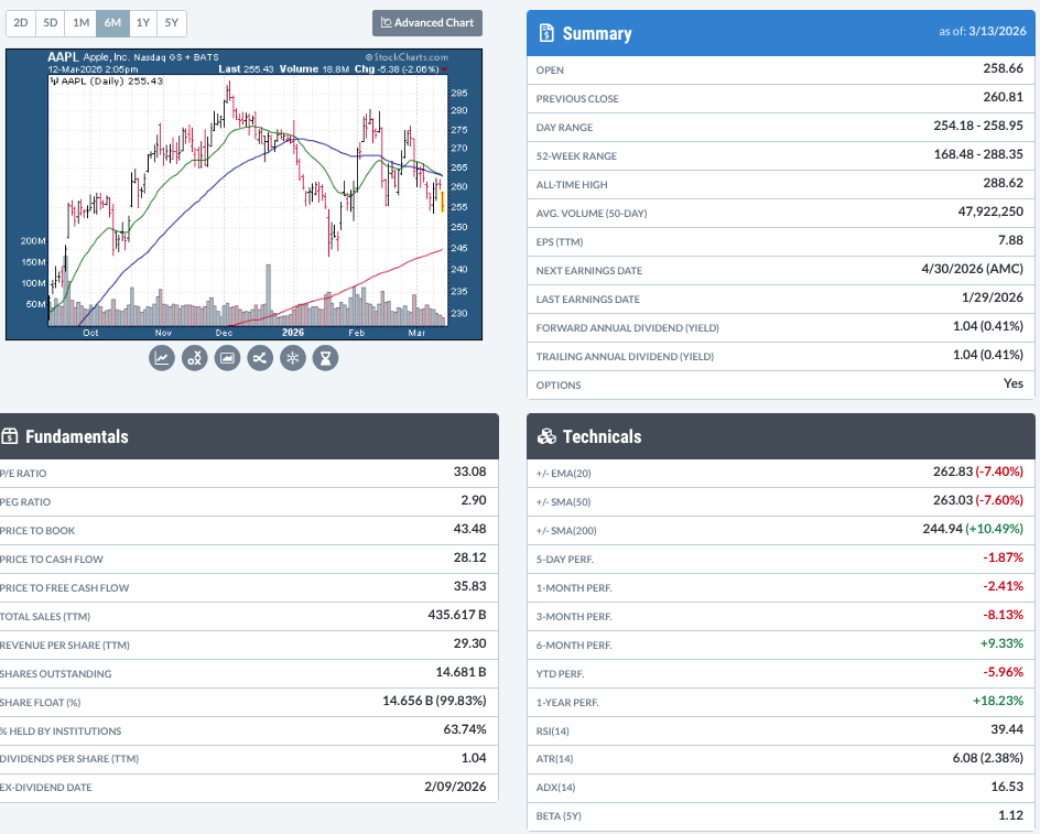
Some traders like to see both technical charts and fundamental numbers. The Symbol Summary page bundles EPS, beta, dividend yield, earnings, and more into one clean table. Think of it as a quick 360‑degree briefing before you dive deeper.
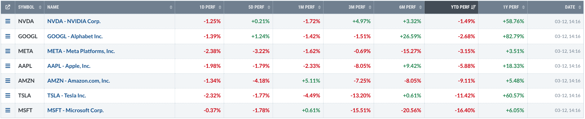
Tip #5: Use the Performance view to spot consistent strength.
The Performance screen shows returns from one day up to a year. Stocks that do well across many periods are usually strong. If short‑term returns start to drift away from long‑term trends, it may signal a change in momentum.
Tip #6: Look at Options for extra trade ideas.
Before you buy a stock, open the Options tab. The option chain shows calls, puts, and advanced strategies, plus where other traders are placing their bets. This gives you another layer of market intelligence.
Adding a Seasonal Angle
Tip #7: Check how a stock behaves at different times of year.
Seasonality charts display a stock’s historic performance by month. Zoom out for long‑term patterns or compare a stock’s seasonal trend to a benchmark like the S&P 500.
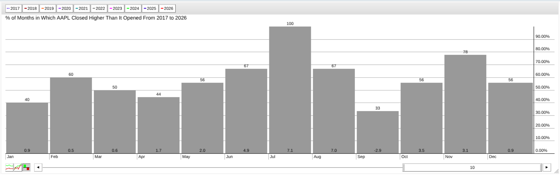
For example, Apple has risen about 7 % on average each July over the last ten years. When current price action lines up with that pattern, it adds useful context.
Tip #8: Turn the whole list into a heat‑map with MarketCarpets.
MarketCarpets paint every security in your list with colors based on price change, RSI, SCTR, or other metrics. In a glance you can see which areas are strong, which are weak, and where surprises might be hiding.
Try It Yourself
Open any ChartList you already have and test a few views:
- Start with CandleGlance to see the overall direction.
- Switch to RRG to watch how leadership moves.
- Look at Seasonality to find stocks that tend to do well in the coming months.
Do the charts agree? Do they show different signals? Then open the Symbol Summary to see if the fundamentals match the technical picture.
Final Thoughts
Charts tell a story, but they rarely tell the whole story. ChartLists act as an analysis dashboard, giving you many viewpoints—trend, leadership, momentum, fundamentals, seasonality, and market heat. The more angles you have, the better decisions you can make. Open your ChartList, explore the tools, and start looking at the market like an insider.
Source: Materials provided by https://articles.stockcharts.com.Note: Content may be edited for style and length.